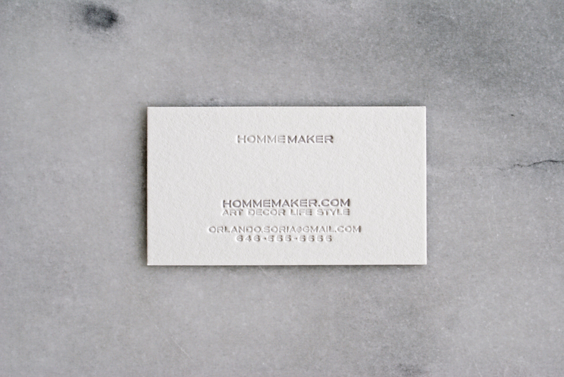
Dear Reader, As you may have noticed, I’ve done a little bit of restyling to Hommemaker.com. The changes include: ▲ Wider pictures (formerly 500 pixels wide, now 700 wide). ▲ Simpler, cleaner navigation featuring four main categories: Art, Decor, Life, Style. ▲ No ads. Although this is going to change. I’m working on incorporating ads for products and services I actually like and use. When they come back they’ll be hand-selected and more thoughtfully worked in to the site’s layout. All of these changes were made possible by my awesome web designer Forster Rudolph. The whole redesign is a sort of mini-rebranding for…
