Dear Movielovers,
Of all people on a film set, those who work in the art department are the most underappreciated. Production Designers, Art Directors, Prop Masters, Set Decorators, Set Designers, etc, have to show up before everyone to make sure the scene is set and have to stay after to wrap everything out. If an actress knocks over a glass of wine or a curtain falls down, the art department is summoned by a shrill “ART DEPARTMENT!” screech from the Assistant Director. Then, when the film comes out, no one even notices what you did. The whole point of designing film scenery is to make it seem like it’s exactly as it should be. It shouldn’t distract from the story. This is why no one knows who any production designers are. For example, tons of my friends went and saw the wonderful film “The Help” over the past two weeks. They all loved it, but not one commented on the art direction. Probably not one of them could name the production designer, Mark Ricker. All he did was create the entire world that the characters inhabited, that’s all. My point here is not to get all whiney about how no one pays attention to production design (too late!) but to bring up the fact that it’s underrated. Thus, I’m going to start posting images from films I love, exhibiting the glorious scenery created by their production designers and art departments.
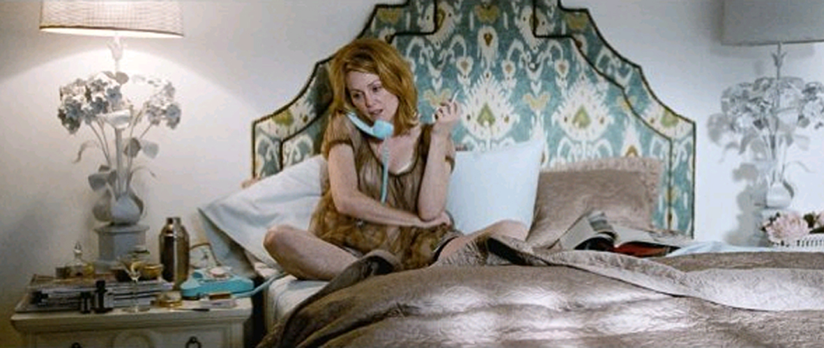
The first film I’d like to discuss is Tom Ford’s ‘A Single Man,’ with production design by Dan Bishop. This film is a beautiful/tragic love story that takes place in 1960s Los Angeles. The film is full of gorgeous imagery and lovely muted colors.
The house inhabited by the film’s main character is awesome. Designed by John Lautner and located in the hills of Glendale.
The flashy home Julianne Moore’s character lives in reflects her glamorous, outrageous personality.
These pictures don’t really do justice to the beauty of the film’s production design, so it’s very important that you watch ‘A Single Man’ as soon as possible.
Love,
Orlando


I want to live in that house!
I want to live in that house, too!
Thank you so much for this post, Orlando! As a set decorator, I know what you’ve said here could not ring any truer. My favorite experience is when after seeing a trashed, empty location on the scout, the AD and DP come into the finished set and the only comment they make is, “Oh, so you painted in here. Looks great!” Yep, we also retiled the floor, added chair and picture rails, put up wainscoting, built cabinets, changed out hardware, tiled the backsplash, added crown moulding, sewed custom window treatments, dressed in the furniture, wired and hung practicals and sconces, added all the little layers of dressing, and rigged the oven for your burning cupcakes gag. And we did that all with only $50 and a wire hanger.
I’ve looked up to Dan Bishop and his decorator Amy Wells for quite some time and their work on ‘A Single Man’ is stunning. I’ve also heard a few frightening tales about their tedious collaboration with Tom Ford, but that’s another story…
Loving the hilarious blog and LOVE LOVE LOVE you and Emily on SFAS. Your bold and eclectic mix of styles is a true voice of its own and always inspiring. Keep it up! Hugs from Brooklyn.
Hi Orlando! I just discovered your blog through Emily Henderson and I’ve been enjoying going through all of your old posts. They are really great! I liked this one especially because I love the set of Suburban Girl and I feel like more people need to know about it! It’s really beautifully designed. (I actually posted about it here: http://thepinkchalkboard.blogspot.com/2011/05/suburban-girl.html) Anyway, best of luck with SFAS and your career! I’ll be watching and reading 🙂