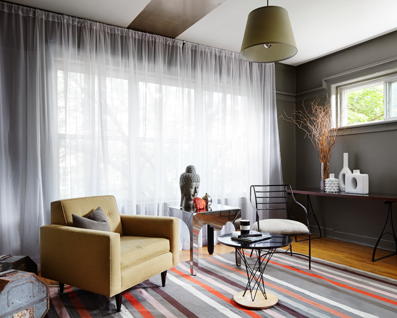
Design by David Hopkins, Photographs by Dustin Halleck courtesy Homepolish
Dear Reader,
As a Creative Director for Homepolish, I am exposed to brilliant work by talented designers on a daily basis. This week I’m featuring the work of Homepolish Chicago’s David Hopkins, who transformed his one bedroom Chicago apartment into a six-bedroom glamormansionapartment. I’ve lived in one bedroom apartments in different cities for my whole adult life, so I can’t imagine what you’d do with all that space. Not a problem for David, who has like 47 living rooms and the biggest dining room you’ve ever seen in your life. Read on!


David’s bedroom was the part of his home that first caught my eye. He used an awesome (and sadly no longer available) Ikea bed, which he custom painted a bright yellow to contrast the grey walls. One of the strongest elements throughout his home is the use of color. A theory I’ve long held to is that if a space gets a lot of natural light, it’s a good idea to paint it a light color, even white. If a space is darker and doesn’t get as much natural light, paint it a more saturated color to give it an intentional, romantic look. Many people think painting a dark room white is going to make it seem brighter. Quite the opposite, normally it makes it look dark and dingey and depressing.

I love David’s little pops of color blocking throughout the house. It’s a creative way to accent the traditional architecture.
David is a talented thrift shopper, with a ton of amazing vintage pieces all over his home. Like this amazing mid-century lounge chair. A great way of making these pieces look as beautiful and sophisticated as possible is to pair them with a fresh contemporary piece, like David does here with that awesome brass floor lamp.
All his art is steal-worthy. I kinda wanna get on a plane, go to Chicago, put on a bandit costume, and jump in a window to thieve it all. Sorry David.
You guys, this dining room is outta. As in outta control. I don’t personally know David, but he must be like the most popular man on Earth to need this many dining chairs. Can you imagine: “WILL SOMEONE PLEASE PASS THE SALT?” And then it takes like two hours and forty five minutes to get the salt from the other end of the table. Ridiculous/necessary.
Literally, everything in this room I want in my house. That crazy praying mantis standing lamp, that coffee table/pouf situation, that fluffy deadanimalrug, all of it.

Another dark and romantic room, with lustrous indigo drapes and fancy peacock blue walls. Lots of people are scared of mixing blues. I don’t really know why, lots of blues like being mixed with each other. But this example looks great, and makes me want to drop everything I’m doing and paint/reupholster/stain everything around me a gorgeous hue of blue.
I love this room. That royal blue painting gets to have its diva moment and the rest of the room supports her in quiet adoration. All the subtle tones make this space look warm and welcoming. A lot of people go overboard with wanting every piece in the room to be a crazy statement. Sometimes the most gorgeous design compositions are those that allow one piece (in this case the art) to shine and surround it with subtle, more low-key pieces. I try to do this in my design work and LOVE how David does it here.
Kitties are a thing now. All the designers are placing them in their photo shoots. I’m allergic (like, emotionally) to cats but maybe it’s time to rethink that…

Another room where color is used brilliantly. I love that bright, pop painting and then around the corner those bright chairs that are just far away enough not to be in direct competition.

Maybe it’s because I’m a proud American (red, white, and blue!) and I’m dating a proud Frenchman (red, white, and blue!) but I just love this color combo. It’s classic and pretty and just makes sense. AMER… I CAN!
You know how I feel about pottery so you know I’m literally losing my mind right now looking at this photograph.
This cat also loves pottery.
So does this man bust.
This armadillo is also a huge pottery fan. Duh.
I’ve never been to Chicago but now that I’ve seen this I’m ready to move in. I’m sure David can find room for me in one of his six bedrooms…
Love,
Orlando
PS: Still hungry for more? Homepolish has tons more photos in their two-part series on this place (yes, it had to be two parts because it’s that gigantic). Check it out Part I and Part II.


Love the shelves painted to match the walls and that deer head looking away. HomePolish never disappoints!
Off the hook!
I want to go to there
I’m with you on the dining room, and I can only imagine the dinner parties/subsequent photos that would be taken at that table.
I wish there was a Homepolish Saint Louis. Getting closer? Your writeup is awesome, and I have to imagine he has a team of wait staff to throw those dinner parties.
Love the mix of treasures. Edited to perfection!
Love you Orlando. Think you should know that “man bust” towards the end of the post is the Chinese dictator Mao. To a lot of people it is akin to having a bust of Hitler or Pol Pot prominently displayed in your living room.