Ah, where to begin with the Great Bungle of Bungalowlando. If you’ll remember, I decided to rent this small home in June 2021 when it *seemed* like the financial tumult of the past year was over. Momentum was gathering, more and more work was pouring in, and in the month of May, I’d booked $250,000 worth of guaranteed partnerships (contracts signed) to be completed before autumn 2021. I have no idea why I had the optimism I did, I think like all of us I just keep expecting “all of this” (whatever that means) to be over soon. And while things have improved vastly, little hiccups happen here and there that remind me we’re still kinda “in it” (whatever that means). Aside from deciding to attend graduate school at The University of Pennsylvania (which ended up being a complete boondoggle despite the Ivy League branding), renting an apartment in LA while I still had another place to live is probably the worst financial decision I’ve ever made in my life.
But what I learned from the guilt and shame that surrounded me after I graduated from Penn with a TON of debt, there’s not really a whole lot of good to come from feeling stupid and bad about your past decisions. As human beings, we all do our best to make the wisest decision with the information we have. And sometimes that means we make dumb ass decisions. Ooops! When you’re a freelancer, you base your financial decisions on patterns you’ve observed over the course of your career. And sometimes those assumptions are wrong.
2022 has proven to be much more stable than either 2020 or 2021. And when I look back at those two years now they just stick out as one long Worst Year Ever, mostly because of the financial stress I was under combined with an overwhelming amount of deadlines set by companies that would wait nine months to pay me. I’ve been in a bit of a holding pattern since I started working on getting my vacation rental permits in late 2021, thinking at any moment I would need a place to stay while I rented my cabin out. But that process ended up taking much longer than expected (we’re coming up on a year soon).
Anyyyyyywayyyyyyy. I didn’t come here to rehash the past few years again. But here’s why I never got rid of my LA place even when stuff started to get a little rocky financially. Firstly, I’d put a TON of sweat and tears into getting this place set up. I was adamant that Satie have a backyard and designing and installing that took a lot of time and money. I have a good deal of brand partnerships tied up with the LA place now so it wouldn’t actually make financial sense to get rid of it. Add to that that the whole reason I rented it in the first place was to capitalize on the then-cheaper rents before they started to go up (they did, by a lot). So, yeah it was a terrible financial decision to keep this place. But also yeah I knew I’d regret it if I gave it up, had to move all my stuff, then had to find another place to rent once my cabin was ready to rent out. Finally, I moved twice in 2020-2021 and I hate moving more than anything in the whole entire world. Plus, it’s not free. So it may not have made sense to waste $10K on moving expenses when EVENTUALLY I’d need a place in LA again.
I don’t know why I feel like I have to go over this when I talk about Bungalowlando, I guess I still have some self-consciousness about having two places when that wasn’t exactly my intent. Especially during a roller coaster few years where my finances were up and down.
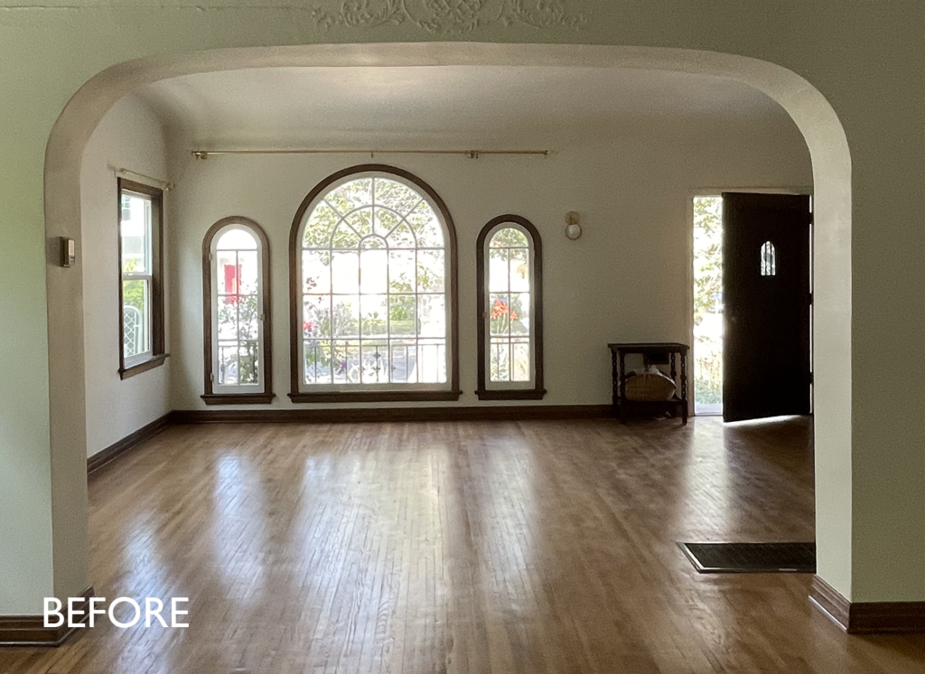
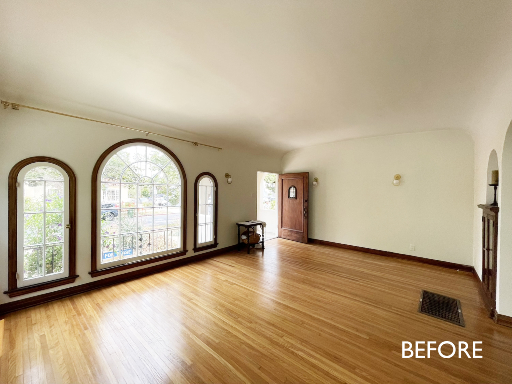
My strategy with finding rentals (and buying a house now that I think about it) is to look for something a little worse for the wear that has potential. I have always dreamed of living in a Spanish style home – it just feels like the quintessentially 1920s Los Angeles vibe. So much warmth and character. So when I saw this cute little house (it’s actually a duplex but it looks just like a house because the other apartment is tucked behind mine) I knew I had to have it. Did it have a good paint job? No. Was the backyard a depressing drought hellscape of doom? Yes. Was it perfectly maintained? Absolutely not. But I could tell that with some TLC this place would be great.
One thing I didn’t anticipate is how involved the landlord would be. Typically, in the more “worn in” apartments I’ve had, the landlord is kind of MIA. I didn’t expect my landlord to be on site ALL THE TIME, but it turns out he likes to do a lot of the work himself (to varying degrees of success). I really love my landlord and his family but I do feel a little watched sometimes – things like him stopping by unannounced needing to get into my apartment or my backyard. It’s not that there’s anything sketchy going on in my place, it’s more that I like my house to look a certain way when people see it. So I’m not really a fan of having a landlord who will give me two minutes notice he’s dropping by while I’m hundreds of miles away at Londo Lodge. It’s caused a little bit of tension because while I love the landlord, I also need to feel like I have some privacy. If being a home owner has done one thing for me, it’s kind of given me a sense of entitlement about having autonomous control over my space. And there’s a reason there’s laws against landlords doing what mine does – stopping by without notice. Renters deserve to live in a dignified way where they aren’t constantly under surveil.
All that being said, if you’re in the market for an apartment and you’re a big DIYer that likes to maintain your own space in exchange for a hands-off landlord who lets you do whatever you want, I still think my strategy of looking for a sort of dumpy apartment with potential is a good one. I get a lot of questions about whether my landlords ever compensate me or give me a break on rent for the improvements and upkeep I do on their properties. The answer is NO. If you remember my last LA place, Chateaulando, you’ll probably remember I ended up being swindled by my landlord who agreed to split the cost of the kitchen then forced me to pay $25K to finish it once the old kitchen was demolished. That experience definitely made me less trusting of landlords, which probably hasn’t helped in the current situation. Anyway, don’t worry there’s not beef with my landlord. It’s more that I’m just getting used to having one that is constantly around looking over my shoulder while I work.
Sources: Elsmere Sofa, Embroidered Pillow, Terra Cotta Art, Terra Cotta Shapes Art, Abstract 8 Art, Marble Side Table.
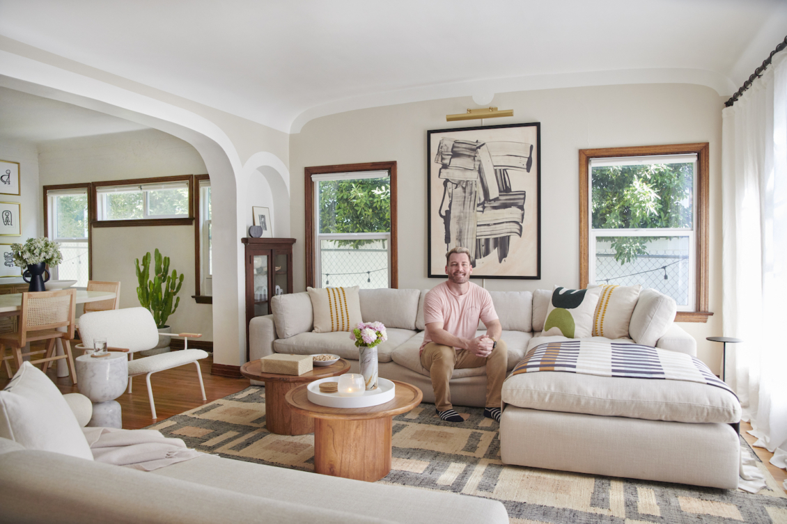
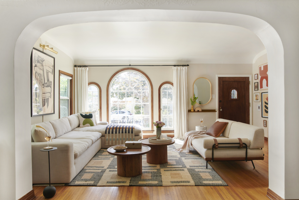
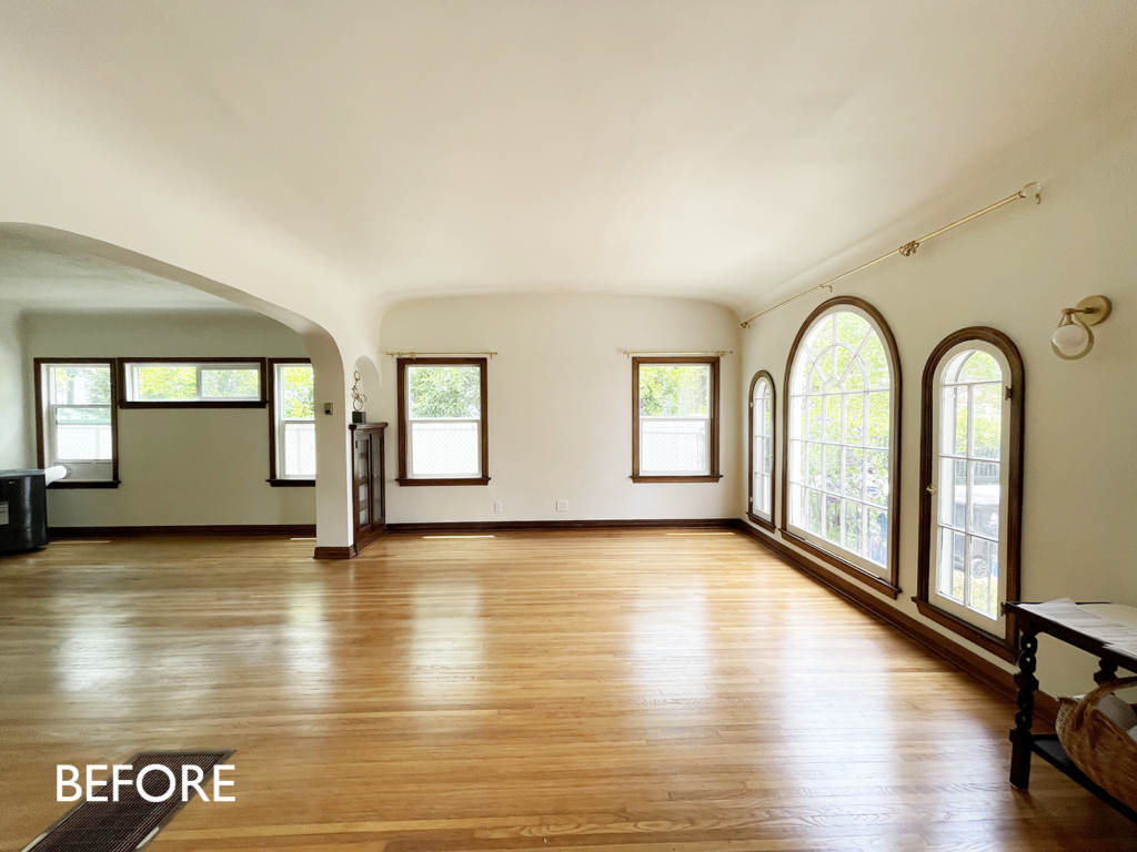
Now that I’ve blabbed about my life forever let’s chat about what I did in this room. The Bungalowlando living room is actually bigger and more grand than the tiny one at Londo Lodge. I loved the detail of the curved ceiling and the beautiful arched windows. While I feel that arches are getting a little played out right now (and installed into homes in which they don’t make sense) I love an arch in a Spanish home. With my paint job (which I will describe in more detail at some point), I tried to accentuate the curves while allowing a natural stop for a wall color. I have no steadfast rules about ceiling color, but I’m generally a fan of having a contrasting ceiling. What this does is it allows your eye to see the color of the walls by contrast to the white of the ceiling. This is an especially nice detail if you use a very faint color (like I did at Chateaulando) as it brings the color to life rather than if you painted it all the wall color (in which case the walls might just look white). My junior designer Quinn and I played around with the trim shape around the ceiling for a while before we settled on the final arch with half-circle accent look. I love the way it turned out and how it showcases the home’s stunning architecture. The beautiful daybed in here used to be in my guest room. It actually doubles as a twin sleeper sofa which is amazing. It’s not easy to find sleepers this attractive! I decided I wanted a bigger bed in the guest room and I wanted to see this every day so I brought it out into the living room. The added benefit is it’s streamlined and low so it’s perfect to go in front of a TV.
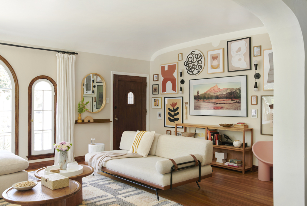
Sources: Elsmere Sofa, Embroidered Pillow, Terra Cotta Art, Terra Cotta Shapes Art, Abstract 8 Art, Marble Side Table, Coffee Tables, Picture Ledge, Mirror, Yellow Vase, Rainbow Vase.
I knew from the get-go that I wanted to do a gallery wall around my TV-That-Masquerades-As-Art so I sourced a bunch of artwork from AllModern to get my gallery wall started. AllModern has always been a go-to for great contemporary pieces but they’ve really amped up their art and accessories and I had a great time scouring their site to find art I could fill my walls with. I wasn’t a fan of the light fixtures the previous tenant put in so I swapped those out for some mid-century inspired double sconces that flowed better with the wall art.
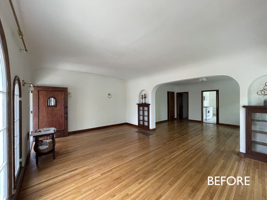
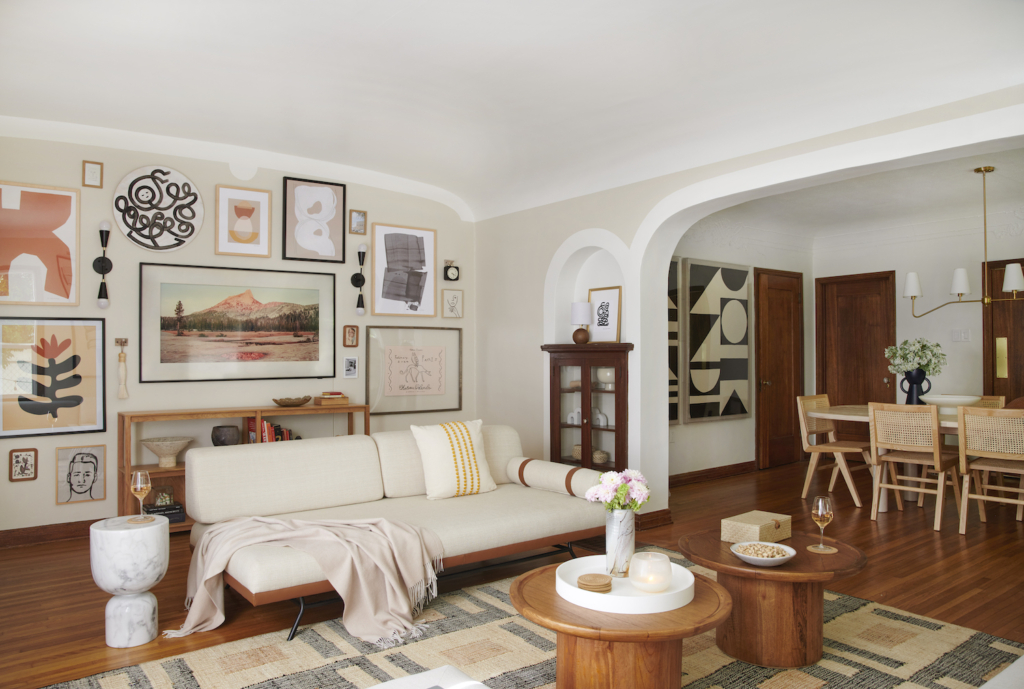
Sources: Elsmere Sofa, Embroidered Pillow, Terra Cotta Art, Terra Cotta Shapes Art, Abstract 8 Art, Marble Side Table, Coffee Tables, Picture Ledge, Mirror, Yellow Vase, Rainbow Vase, Dining Table, Dining Chairs.
How satisfying are those borders around the arches? I love looking at them. While I may regret my time at Penn (which is a longer story for another day), getting an MFA in painting definitely made me an expert painter and I’m guessing over the course of my lifetime I’ll probably save as much money on hiring painters as I spent on my education. The two ADORABLE coffee tables solved a few issues for me. Firstly, I can stagger them so they engage both the daybed and the sofa. The second issue solved by these (and one I hadn’t even thought about before I got them) is that they’re light and easy to move and perfect for when I want to pull up a table and eat dinner in front of the TV. Some spaces can be little confusing when it comes to choosing a coffee table. In those cases, doubling up a smaller table can be a great solution.
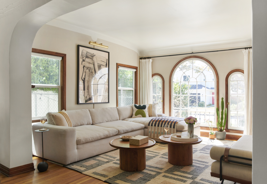
Sources: Sectional, Coffee Tables, Black Side Table, White Lacquer Tray (Similar to shown), Jason Wu Throw, Elsmere Sofa.
The real pièce de résistance of this room is the beautiful, EXTREMELY COMFORTABLE sofa. I had to measure over and over to see if it would fit. And quite frankly, it’s on the larger side of what can comfortably fit in the space. It has luscious down-wrapped cushions and is super deep. It’s perfect for snuggling your boyfriend while you watch TV. Or if you don’t have a boyfriend you can always snuggle your pit bull on it. Just hypo ethically speaking of course.
A downside of choosing a historic building over new construction is they often lack many of the modern amenities you might expect. This place has no AC and because of these big gorgeous windows it gets HOT in here. While I shot these images with Tessa Neustadt (who I was delighted to be reunited with after not having the chance to work with her for years), the apartment was around 90 degrees. I have little roll around AC units but they do NOT work. And honestly I thought I was having a hormonal issues because I was constantly sweating in my house. I was like OH MY GOD IS THIS WHAT BEING 40 IS LIKE? Seeing everyone sweating their faces off during the photo shoot made me feel bad that I didn’t have AC. But it also made me feel relieved I wasn’t having menopausal hot flashes. The plan next year is to get window units (not these rolling ones). Hopefully that’ll mean I can be in LA without having a heat stroke every time it’s over 80.
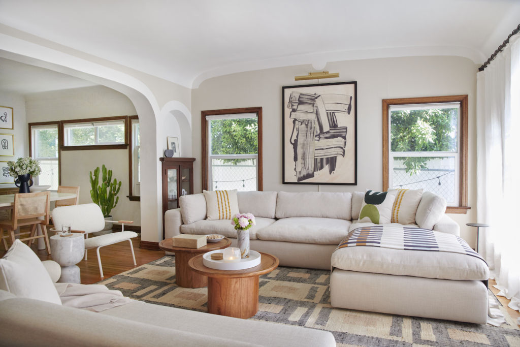
Sources: Sectional, Coffee Tables, Black Side Table, White Lacquer Tray (Similar to shown), Jason Wu Throw, Elsmere Sofa, Marble Side Table.
One of my greatest loves lately is a tiny side table. There are so many situations in which they are a godsend. Like when you have a large, luscious sofa that least little space for a side table. The cute and tiny Walt Side Tables are a great solution because they look chic and are super easy to move around based on your needs. I wanted to add little hits of black here and there throughout the room to tie in a little nod to wrought iron and its omnipresence in Spanish spaces.
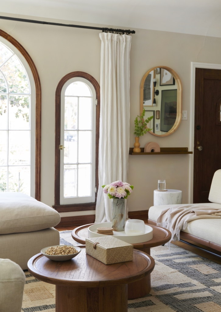
I wanted a little place to drop my keys and wallet when I walked in the front door, so I capitalized on a tiny little area next to the incoming mail slot. Before this, I was carrying everything into the kitchen so I thought it made sense to relocate this drop off space to the front door. I had to be pretty strategic though, because it’s a small space. So I added the a pretty brass picture ledge and a mirror for last looks.
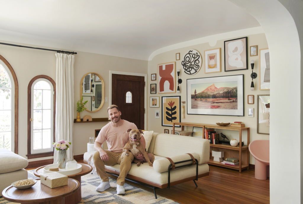
It’s been almost a month since I have seen this living room. But I’m wrapping up a few very exciting projects at Londo Lodge this week and hoping to return early next week for *hopefully* most of the month of October. And in positive news, I’m finally seeing the light at the end of the tunnel for the cabin – which is close to being at a place where I can stop working on it for a while (until I start the kitchen renovation in early 2023 LOL). But the energy has shifted for me – things have calmed down a bit work wise so I’m more able to enjoy the work and have fun with it. While it’s been a life long dream to buy a house and fix it up myself, it’s also been a lot to try to be doing physical construction work while also staying on top of running multiple businesses. So I’m happy I’ve gotten to a place where the work is more enjoyable. And, hopefully, a place where I’ll get to spend time in this wonderful living room more often.
If you’re wondering why I haven’t linked ALL the items in this post, it’s because it’s part of a year-long collaboration I’m doing with AllModern. This partnership has been wonderful for me because it’s given me the opportunity to choose from their varied and beautiful collection of ONLY THE BEST of modern. If you’re looking for a refresh this fall, I’ve got you covered. I’ve sorted through their vast selection to show you some of my favorite finds on my Fall Picks Landing Page. Head on over and check it out! And you’re going to love the updates we have in store for holiday this year. They not only have the furniture and accessories you’ll need to be the holiday host with the most, but I also snagged my entire holiday decor scheme from their amazing assortment of chic holiday finery. GET EXCITED!
This post was created in collaboration with AllModern. All ideas and opinions expressed are genuine and my own.
Photography by Tessa Neustadt

This is gorgeous!!! I want to come over! Everything is so lovely.
I would feel the same kind of unsettled/uncomfortable if I had a landlord who came over like that all the time. Boundaries! They are important!
Can’t wait for those coffee tables to come back in stock! Love love love this redo!
This room is stunning—I want to put it in my pocket and treasure it. A total dream home.
Honestly, it looks gorgeous but I’m troubled by the landlord not giving 24 hour notice prior to dropping by. Isn’t that illegal?
I always appreciate how transparent and honest you are about your work. The space is absolutely gorgeous.
Love your design work, your writing, your perspective, & your insights. Thank you, Orlando! And thank you for these great recs! The Elsmere sofa might be the exact solution I’m looking for.
I’m so glad you made a favorites page with All modern. Also happy to hear you have some good partnerships! Love how you painted around the ceiling, it really does make it pop in a good way!
Feel you on the landlord situation! I live in a beautiful Spanish style house that’s very old and is my landlords old house and she is very DIY (badly) and comes over without warning.
On a side note- I’m going through a pretty devastating breakup right now and you’re definitely a beacon of hope that I can survive this! I wish I had you to help me reimagine our shared bedroom that is now just mine, because wow even though most of it is mine and stuff that I love just the memories are rough…
I am so impressed how beautiful this room is! The art, furniture, painting…Just Incredible- you are so talented!!!