
Photography by Sara Tramp and Orlando Soria
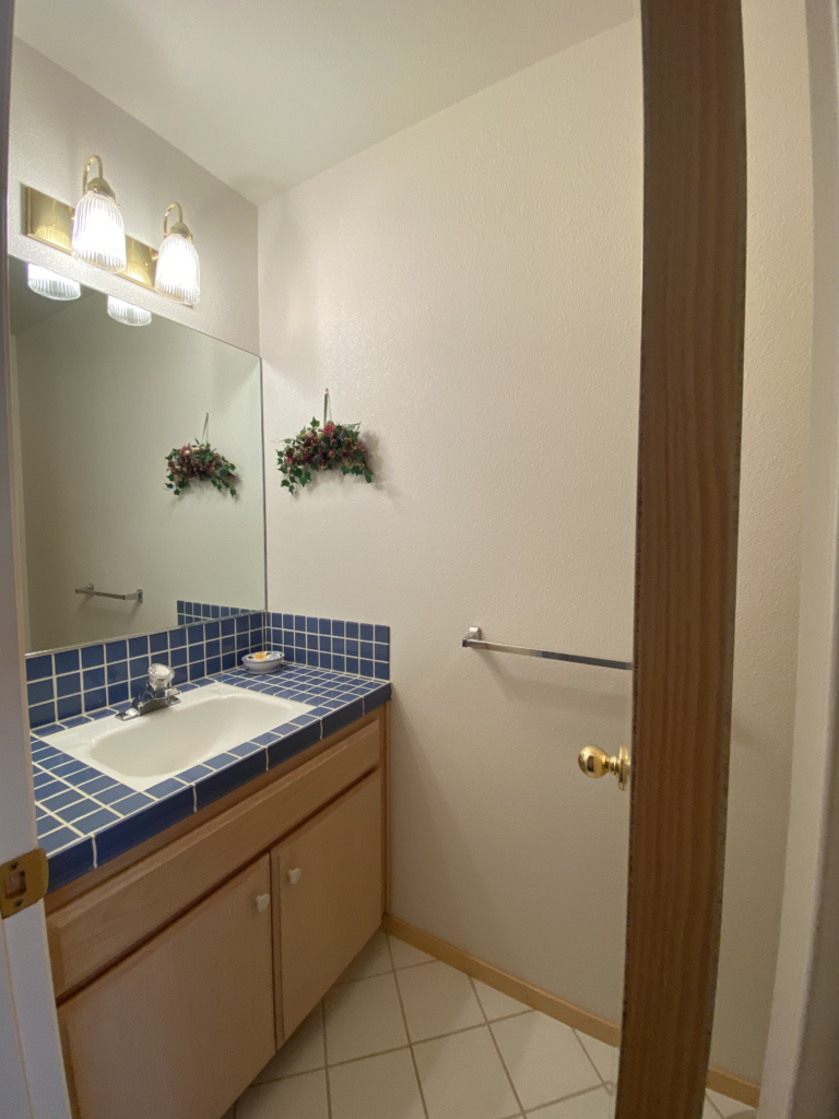
When I moved into Londo Lodge last year, I pretty much took one look at the bathrooms and wrote them off as a lost cause. There are many positive things about the bathrooms, first and foremost that there are four of them. Well, 3.5 (one of them is just a toilet and a sink). Another positive about the bathrooms is the beautiful wood tone on the cabinets. The people who designed and built this house had very good taste in wood tones, they used really nice light toned wood throughout the house, most notably on the cabinets and the doors. I don’t love the style and quality of the cabinets, but the wood is a really warm, neutral color. Of all the bathrooms, the downstairs full bath is the least offensive.
For context, here’s some photos of the other bathrooms in the house:
Downstairs Half Bath 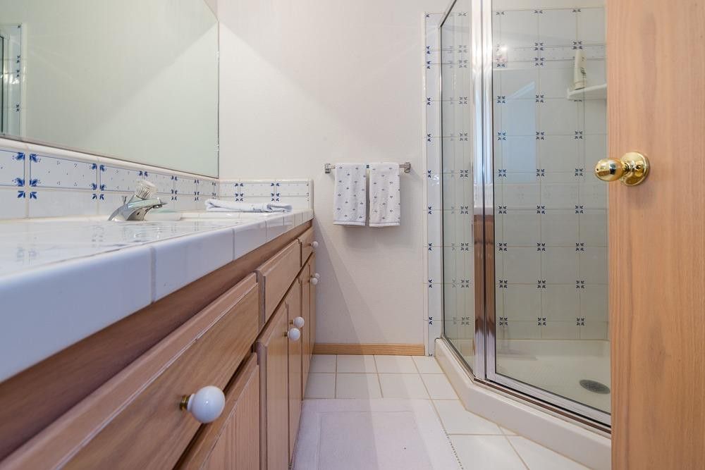
Upstairs Guest Bathroom

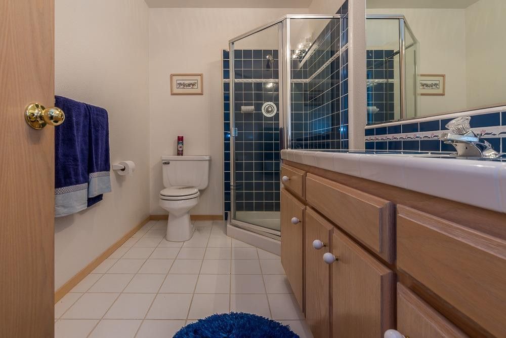
I actually love the color and patterns in the tiles in these other bathrooms. But they are a little challenging in the context of the house, which is pretty much a big 1990s box with no architectural identity, minimal mouldings, not much millwork throughout the house, and a number of contemporary touches. So the cutesy floral, 80s French Country vibes of the tiles is hard to work into any sort of refresh. The downstairs half bath, with it’s beautiful grid pattern indigo tiles, is going to be the easiest to work with of the remaining three. But I’m not quite sure how I’m going to work with the existing tile in my bathroom and the other full bath upstairs. I may attempt to paint over the pattern in my bathroom and add some sort of accent with tile paint. But I may just leave it and see if I can make it work. Regardless, the result of my Phase I updates in these bathrooms isn’t going to be perfect. It’s going to be an “Okay for now” kinda thing. My eventual plan (Phase II) is going to involve completely gutting all these bathrooms. In the two upstairs bathrooms, I’m hoping to knock down the walls between the adjacent (and equally large) walk-in closets, double the size of the bathrooms, and add windows (I hate bathrooms without windows). I’m not sure why a vacation home was designed with such huge closets. I’m also planning on making the guest bath upstairs an en suite because my eventual goal is to have four bedrooms, each with their own bathroom. The upstairs bathrooms have a dropped ceiling to allow for a (completely impossible to access) attic that is currently useless to me but very useful to the family of squirrels who live in there and spend the nights scratching away, plotting to eat through all my wiring. When I moved in I was quoted $5000 to have a pest control company come in and deal with it. But since I plan on ripping the entire thing out I haven’t been motivated to do anything about. it.
My plan for the half bath downstairs is to make it the en suite for my parents’ guest room. I’m excited to share the major renovation plans I have for all these spaces, but for now I’m just trying to get them presentable enough that I don’t hate looking at them and nice enough that they don’t embarrass me as I plan to begin renting this place out as a vacation rental in the new year. I also think of this as a really fun opportunity to create content that’s more accessible than a lot of design content tends to be. Not everyone can afford to rip everything out and start over. So these stories are meant to show you you don’t have to spend tens of thousands of dollars to have a decent bathroom. Things like light fixtures, faucets, wall color, and art can vastly improve a space without moving any walls or changing any hard surfaces. When I can afford to, I’ll make these bathrooms into my dream bathrooms, but for now I just want to be able to walk into them without gagging.

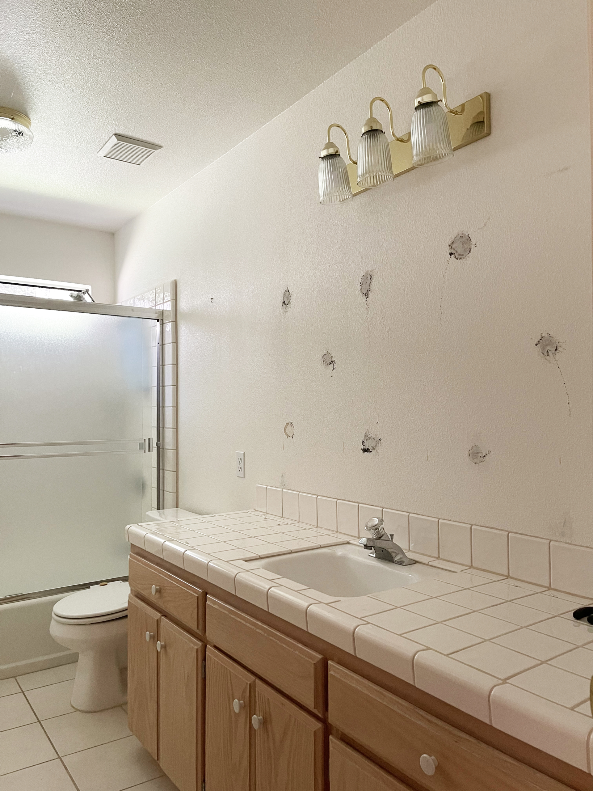
The first thing that had to go was the large mirror that was glued directly onto the wall. I know a lot of people have these and I’ve long been an advocate for ripping them out and replacing them with either a medicine cabinet (useful) or a decorative mirror (pretty). I don’t really know why the glued on ones look so cheap and uninspired, aside from the fact that they are literally the cheapest, least inspired way to put a mirror in a bathroom and a lot of flippers and builders use them because they make the room look bigger and cost $0.00000017. I’ve spent a lot of time contemplating what makes something look beautiful and considered and what makes it look cheap. And I’ve come to the conclusion that our brains immediately process craftsmanship, even if we don’t consciously know that’s what’s happening. Here’s an example: I hate the spray on orange peel texture throughout my house but I actually love a hand-troweled wall texture. You can see the work, the human touch in a hand done wall texture. But when we look at orange peel, our brains process that it’s just a bunch of clumps that were shot onto a wall by some stupid machine. And we absorb that as looking fake or, for lack of a better word, cheap.
The same goes for mirrors. When we see these huge ass mirrors just glued onto a wall, our brains think, “Someone got a mirror cut then used big ass clumps of glue to smash it onto the wall.” And that’s not a very inspiring story. A more inspiring story is “Someone designed and crafted this lovely decorative mirror” or “a team of designers created this very useful medicine cabinet because they knew I, a human being, had the need to have things neatly stowed in my bathroom.” My parents bought a flipped house in 2012 and we’ve spent the last nine years trying to edit out some of the obvious flip moves. I’m actually headed up to their house this week to help orMOMdo remove the glued on mirror in her bathroom and replace it with this one from CB2. Anyway, back to my bathroom…
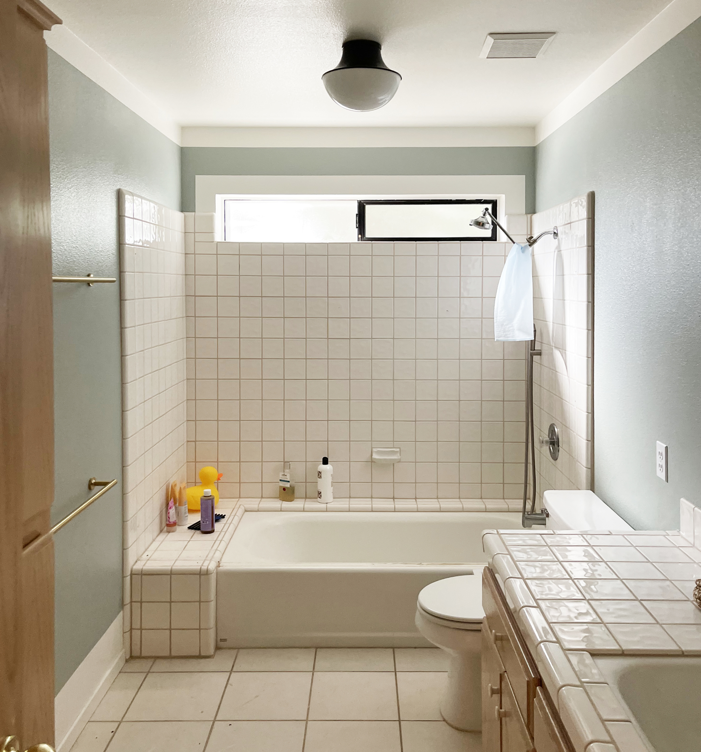
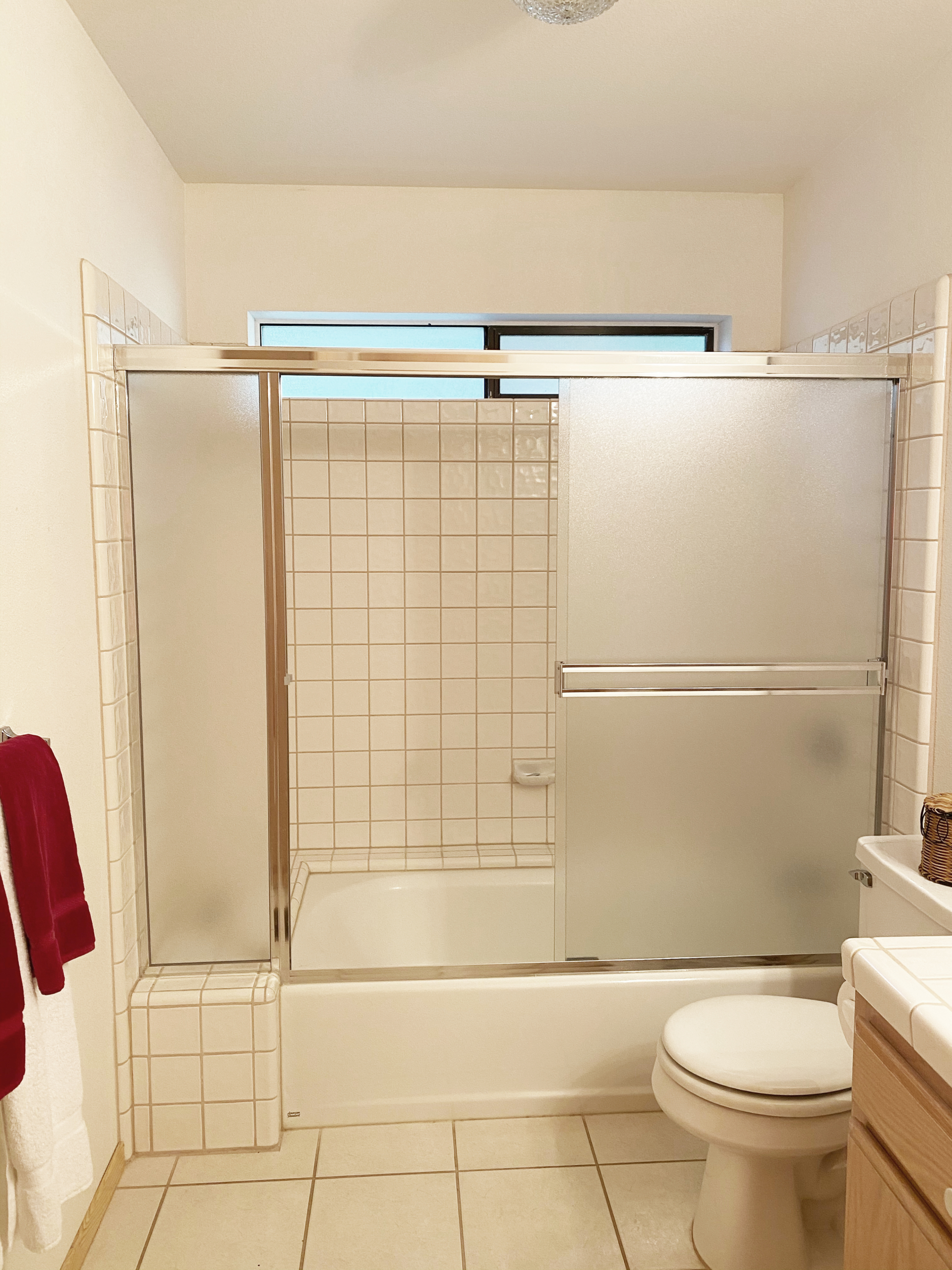
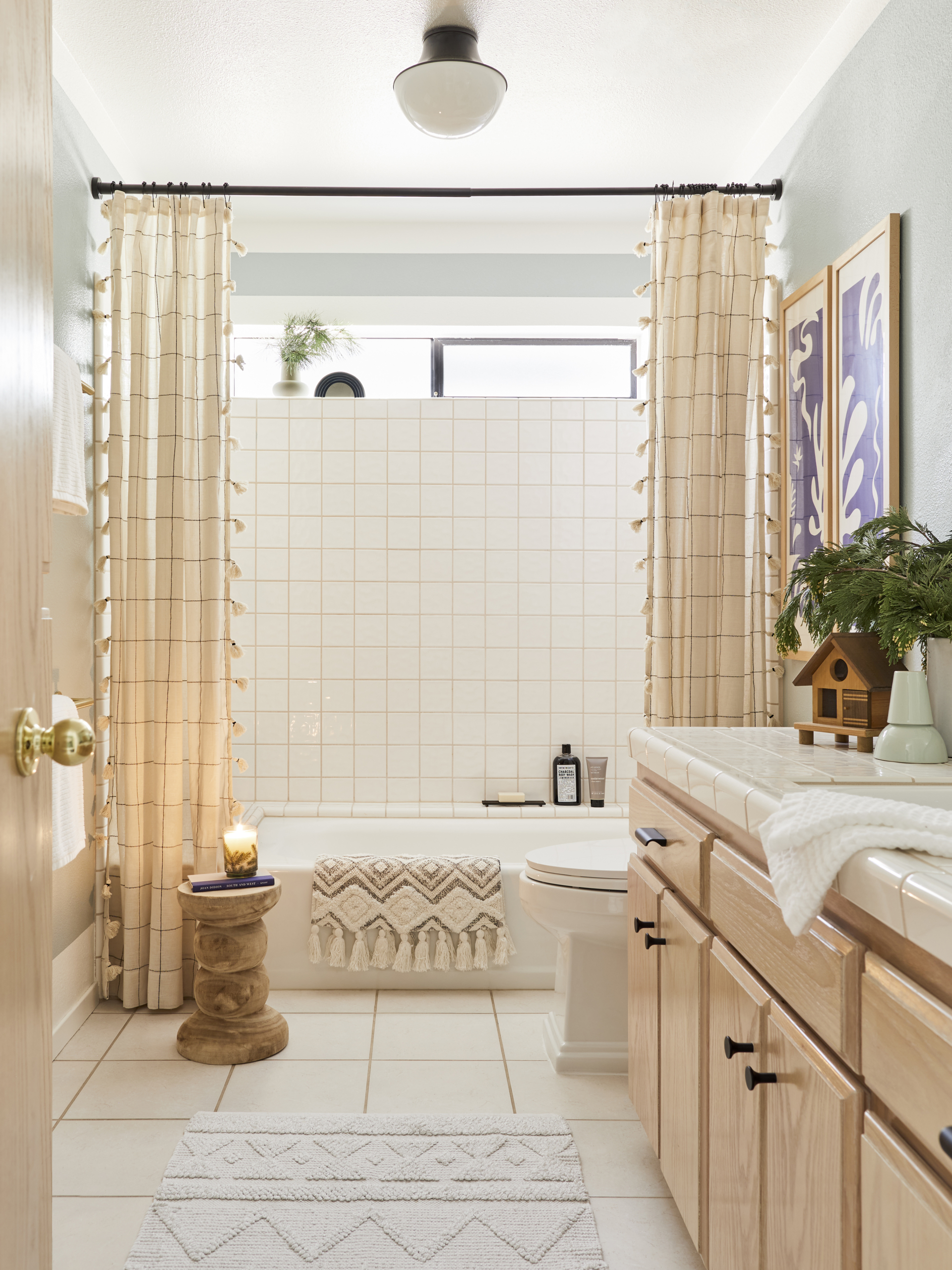
The second thing I did was remove the sliding glass door enclosure to the shower. This was a controversial move. I asked my Instagram followers if I should and it was pretty split. Many people thought it was a decrease in functionality and a lot of people HATE shower curtains, which I understand completely. However, I really wanted that glass door out. Firstly, I hated how it felt to touch. It was cheaply constructed, the handles just felt poorly made, and the whole thing felt like it could fall off its track at any point. Second, I bathe Satie in this bath and the track for the shower door was really sharp on her little feet which meant I had to awkwardly lift her in and out of it. Third, and probably most important to me, having that door there really closed off the bathroom and muffled its only source of natural light, the frosted window in the shower.
To combat the banality of the traditional shower curtain, I decided I wanted to use decorative drapery, hung higher than the traditional 72″ at 84.” I actually sourced a really pretty striped drape from Pottery Barn (side note: they have great ready-made drapery panels) but they didn’t arrive in time for the shoot so I got these panels with a grid pattern and pompoms from World Market. I actually might like this backup option better because it really helps the square tiles make more sense and look less dated. My original idea, which I still want to try, was to get custom height drapery panels that went all the way to the ceiling and install them using a hospital track. The reason I want to try this is that the higher the drapery goes, the more grand the space looks.
Because I wasn’t doing any major construction in here, I wanted to make the existing cabinets look as good as possible. So I swapped out the hardware for simple, modern knobs and pulls from Kohler. Kohler was actually the inspiration for this whole makeover, as they are providing all the fixtures for my bathrooms and kitchen. The beautiful Tresham toilet may look a little formal for the current iteration of the bathroom, but the style I’m going for when I eventually renovate the bathrooms is much more historic and traditional, so I wanted to source toilets that made sense with the eventual vibe (I don’t want to replace the toilets twice that’s too much of a logistical nightmare).
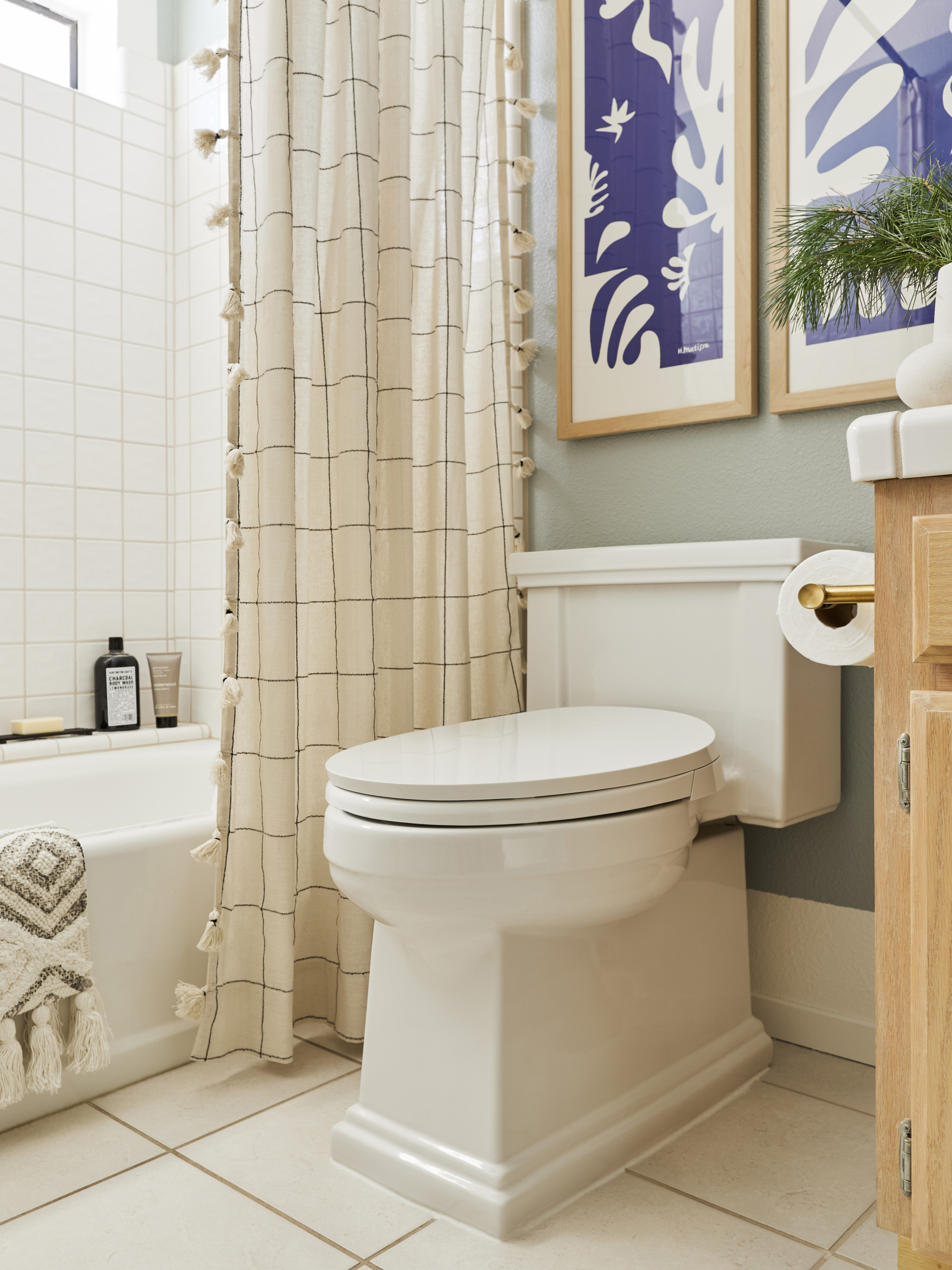
Kohler recently released its first ever manual bidet toilet seat (which can fit most toilet sizes/shapes). If you’ve been following along, you may know that I am a big fan of the washlet and have been for years. I’ve had a Tushy on all my toilets for the past five years. Basically, a Tushy is an inexpensive, easy-to-install bidet toilet seat. And I actually still highly recommend them. But if your toilet is the right proportions for this Kohler version, go with that. It’s a much more elegant design and has wonderful functionality (and the price point is MUCH more approachable than any other manual bidet of that quality).
As with the rest of my interior paint jobs, I added “implied crown moulding” and a chunkier painted-on baseboard by adding borders around the ceiling, floors, and doors. When I get to Phase II, I’ll actually add in crown and substantial baseboards, but for now this tried and true paint trick is giving the space more structure.
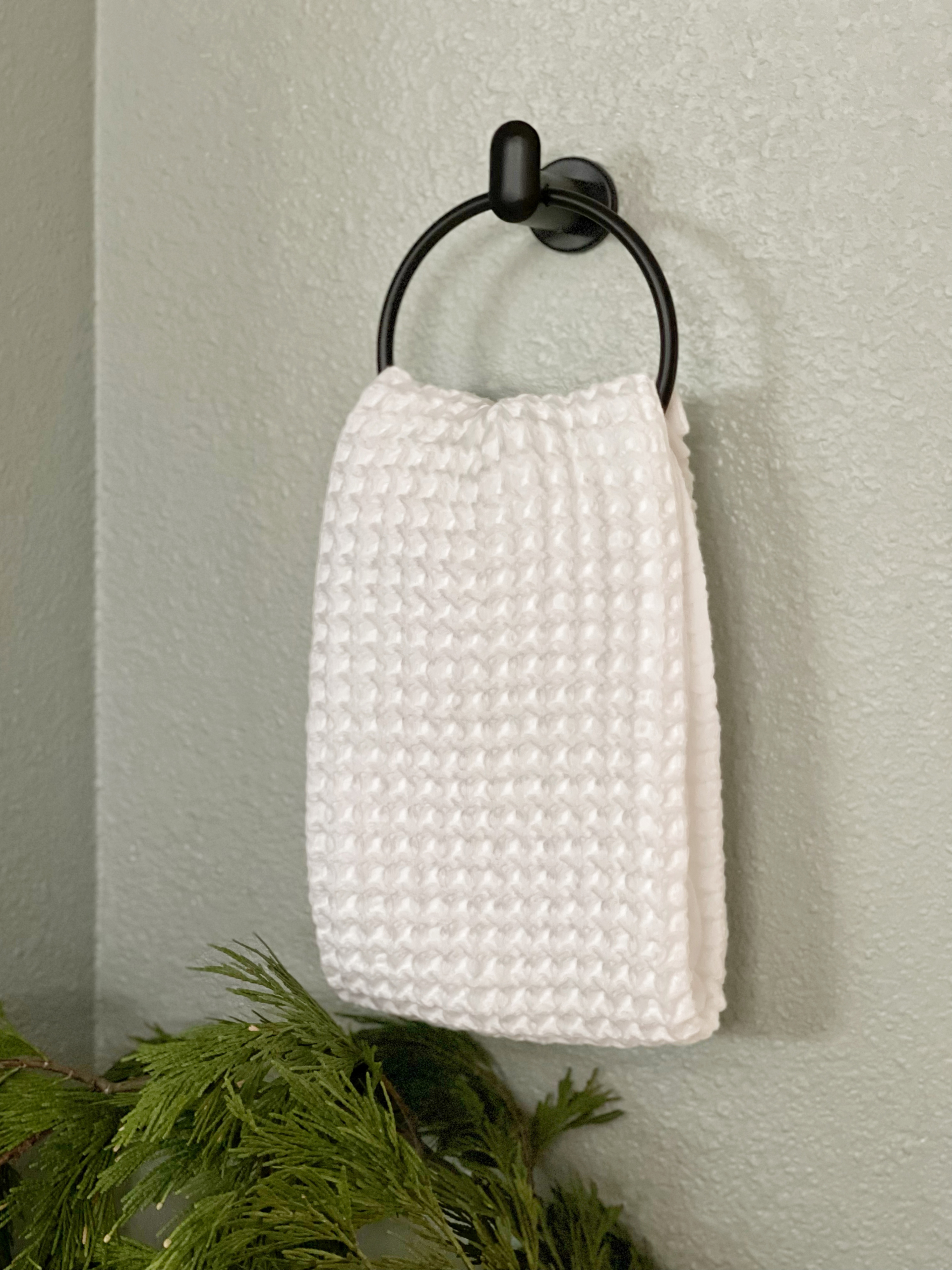
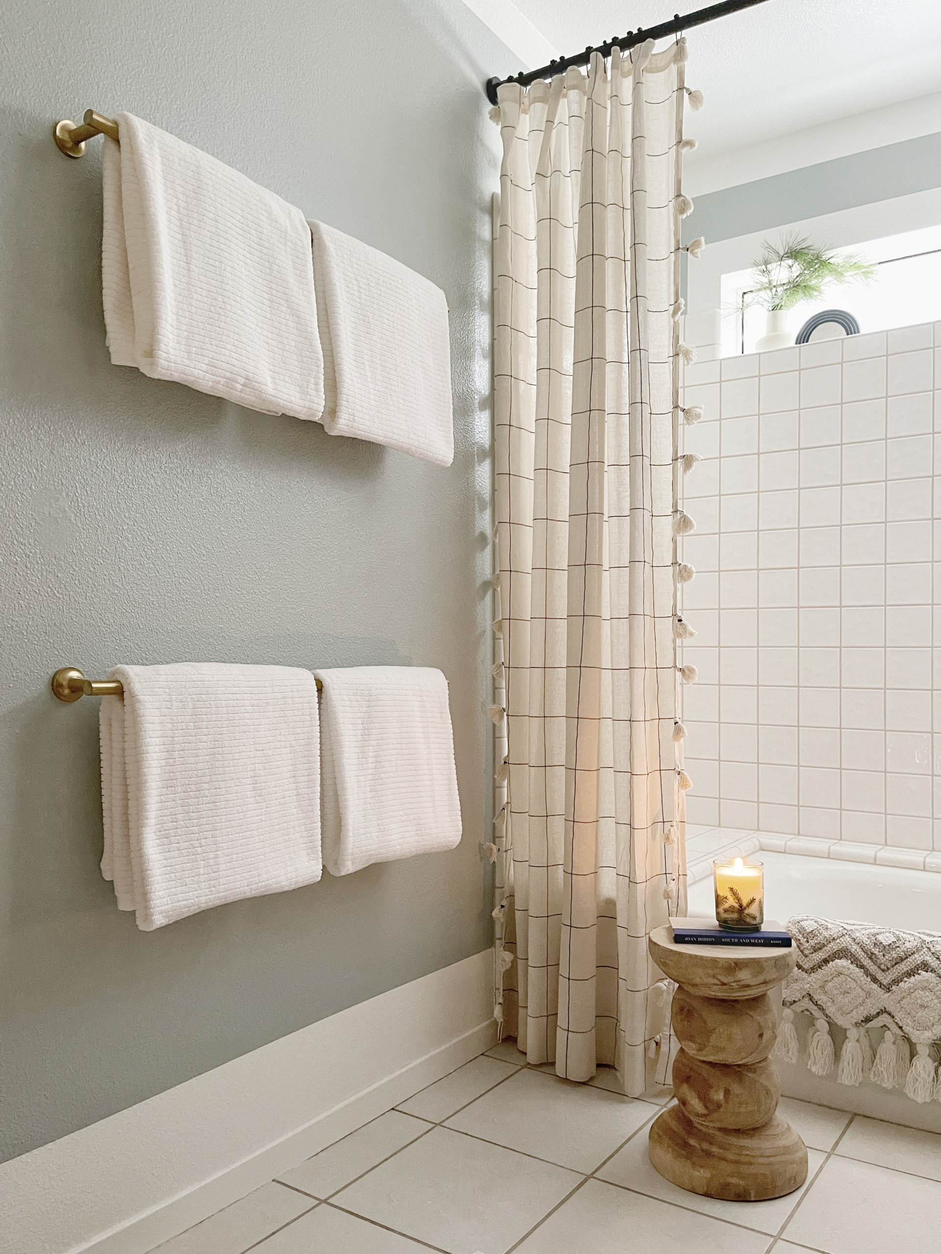
The hand towel ring and towel bars are also from Kohler and they make such a big difference. When updating a space, remember that the things you see, touch, and use are often the first place your eyes go. So swapping out door knobs, faucets, and hardware will completely transform how you see your space. The lighting is from Lamps Plus and helps bring a warmth and elegance to the room. And I’ve been a big fan of this CB2 mantel mirror for a while so I was excited to find space for one in my home.
I didn’t want to spend any more money on paint so I used colors that were leftover from other projects around the house. The walls are True Value Olive Branch, which I used to paint my bedroom and the trim/ceiling are Clare Paint’s Whipped, which is the color I’ve used on the ceiling throughout the house and for the trim/baseboard everywhere as well. Because the light situation is so different, the colors look much different in here than they do in my bedroom and I love how they turned out. In here, they look luminous and warm. In my bedroom, the wall color has a bit more of a moody, romantic vibe.
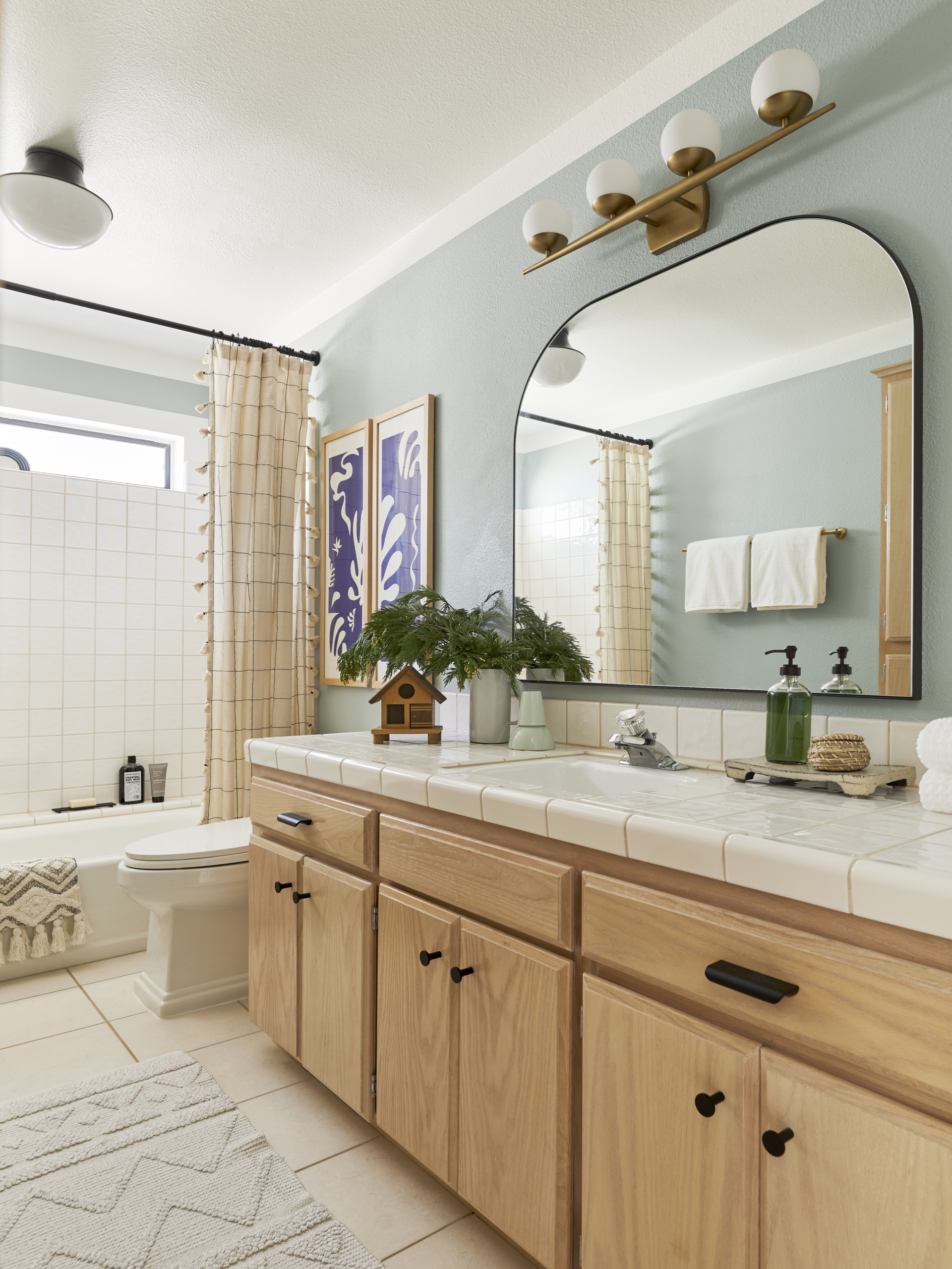
I actually thought about swapping out the faucet and the shower head/hardware. But since I’m going to rip these out, that felt wasteful so I just decided to keep the “meh” versions that came with the house. Also, it was a little hard to get under my sink to figure out what was going on because the two cabinet doors beneath it are actually a pull out and I couldn’t figure out what the faucet hole situation was in the sink. However, once I installed the chic new fixtures from Kohler, the old faucets looked even more dated. But, as I said, this is the “okay for now” version, not the LOOK AT MY PERFECT BATHROOM version.
I have about a month before I want to start renting this place out and a TON left to do. I plan to remove the mirrors in the other bathrooms and replace them with decorative mirrors (except my bathroom which is getting an amazing high tech medicine cabinet from Robern). I also will paint each bathroom, likely with colors leftover from other spaces to save money. But the success of this bathroom’s makeover has made me much more excited about the rest of them. I really like going in here now and think given the parameters it turned out beautifully.
Sources: Tresham Toilet, Purewash Toilet Seat, Purist Toilet Paper Holder, Purist Towel Bar, Kumin Towel Ring, Purist Cabinet Knobs, Avid Drawer Pull, Grid & Pompom Drapery Panels, Diamond Pattern Bathmat (on bath), Shower Curtain Rod, Shower Curtain Rings, Mirror, Vanity Light Fixture, Flush Mount Light Fixture, Hand Towels, Ribbed Bath Towels, Small White Vase (in shower), MQuan Sculpture, Frasier Fir Hand Soap, Frasier Fir Candle, Matte Black Bar Soap Holder.
Did you use anything to remove the sliding doors. I want to do the same thing but, my concern is what was used to keep the sliding doors on the tub and the tile will it be hard to remove.
I’ve removed them before. They are screwed into the walls, and they use silicone to seal the base and the sides. You can remove the silicone slowly and carefully with a razor blade.
I have removed sliding track doors before. Usually the top track lifts off, then remove the doors. The side trim pieces are normally screwed in place, and there may be some caulk. Scrape the caulking away with a razor, then remove the screws and the side rail should come off. The bottom rail is usually held onto the tub edge with caulk or adhesive, so carefully cut away with a razor. You may need to use some acetone to help get the adhesive off completely once the track is removed. Once the rails are completely removed you should only have the side rail holes to fill, find grout that matches your tile color and fill in. Hope that helps, maybe watch a few YouTube videos first.
Gorgeous! We’re in the same place with two of our bathrooms- both builder grade boring and they haven’t been updated in twenty years. We’re saving up for the eventual renos but we’ve made tweaks with paint and hardware to help us not hate them SO much.
It’s amazing what a little updating can do honestly!
I love it. It’s so inspiring to see how you can turn an outdated bathroom into something so much more attractive!
Next week, I’m moving into a 1950 ranch home in LA that hasn’t been updated since…1957, lol. This post is giving me inspiration to try and work with what I have in the bathrooms, at least for the time being. I have the GIANT, glued-to-the-wall mirror also, and now I’m curious what I can find that will make the space feel more custom without a total remodel. It would be nice to lose the mirror, but the trying to update the beige (hopefully that’s the actual color and not 70 years of dirt) vinyl floors is the bigger issue…
Peel and stick vinyl tile is an easy DIY on top of existing sheet vinyl.
You have such a great eye. Love that you are sharing these more attainable (and sustainable!) makeovers ahead of the big renovation!
This is helpful, it’s nice to see an example of the type of bathroom 99% of renters have to work with
Can you tell me where you found the prints over the toilet? I love the pop of color!
Hi! Yes, these were prints my parents got in the 80s, probably at a museum exhibition of Matisse’s work. I haven’t been able to find them online. I had them framed in custom frames a few years ago.
I love the idea of using curtain panels to frame a window in the shower! We have one and I’m always frustrated that you can’t get all the light into the room without the shower looking awkward and open. But, I have a question! What about the shower curtain liner?? Do you hang two? One on a separate bar? Thanks for your awesome content!
Hi! Good question! I actually found 84″ tall shower liner panels on Amazon. I bought two thinking I’d use them on both sides but found out that I really only needed one because the only panel you really need to move is the one on the right (next to shower head). The panel on the left doesn’t really need a liner because it’s mostly there for decorative purposes and to hide that shelf/deck on the left that’s normally covered with bottles of shampoo and soap.
Who makes that wood stool? Didn’t find it in the sources list. It’s fabulous!!