From a very young age, I’ve always experimented with the design of my living space. I started decorating my room with the help of my mom around age seven. My first bedroom design featured lavender walls (HI I’M GAY!), Mickey Mouse curtains sewn by orMOMdo, and Mickey Mouse comforters in bold red and yellow. It was definitely NOT understated. I even painted my bathroom myself when I was pretty young (I think seven or eight) so primping my surroundings is something that is innate to my personality. Thus, it’s been a dream of mine for quite a while to buy a house and learn how to renovate it step by step by myself. And that’s just what I’ve been doing at Londo Lodge!
My fantasy of moving to the woods, basically turning myself into a handyman, and making an ugly house pretty has basically come true. But in reality, it’s been a bit more challenging to get things done in this house than I expected. I kind of imagined moving to the woods would be this quiet, zen experience where everything would be peaceful and stress-free. When you live in a congested city filled with traffic and people fighting over tiny ass Whole Foods parking spaces, you fantasize about country living. About moving to the woods and finally getting to that memoir you wanted to write. Or that screenplay you’ve already written in your head. Or finally read the giant stack of New Yorkers, a magazine that you subscribed to in the hopes that in the woods, you’d finally have the peace of mind to actually read them.
Moving to Fish Camp has been amazing. But I guess I should have known from growing up in the woods that your life kind of follows you wherever you go. Yes, I get a great amount of joy from slowly fixing up this house. But in the fantasy version of this life, I didn’t consider that the rest of your life has to continue in order for you to be able to afford this new solitary life. Doing all this stuff around the house would be a lot more carefree if I were retired, but when you’re on your fourth day of ripping out carpet and driving it to the dump and you pass your computer, noticing you have hundreds of unread emails, it adds a layer of complexity and stress to the situation. I love my job, working with clients and collaborating with brands to create inspirational content, but it’s hard to concentrate on renovating a big ass house with your bare hands AND run your own small enterprise at the same time. When I’m doing “office work” for my various job, I can feel the list of house projects piling up in the back of my mind. And when I’m doing DIY projects around the house I feel myself letting down clients and collaborators by not responding fast enough.
I’ve been trying to dissect this constant stress by acknowledging that it’s a symptom of anxiety that I’ve had for years. I’ve noticed a pattern in myself that as soon as one “problem” is solved, my brain seeks out other issues to be anxious about. For example, I basically didn’t make any money December 2020 – May 2021 and it was VERY stressful (especially because I had a lot of expenses related to getting the house up and running, from the heating to a generator for power outages to the septic system, there was a lot to spend money on). But once my financial situation cleared up and I started making money again, my brain thought of something else to be freaked out about: I HAVE TO GET THIS HOUSE DONE ASAP.
I’m feeling pressure to get the quick and easy updates I want to do around the house done quickly because part of my financial plan for being able to move back to LA and split my time is to rent this place out a small portion of the time (like a week or two a month – I don’t want a lot of wear and tear on my house or anyone messing up the fancy new Bertazzoni appliances I’m installing in the kitchen). Because I’m getting antsy to get back to LA at least part time (I’m starting to feel lonely and overwhelmed by being here and having so much to do with no help), I’m feeling pressure to get all these projects done quickly. Another stressor was added last week when the one handyman I found who was going to help me with the house unexpectedly left town for good leaving me back at square one in terms of looking for assistance in fixing up this house.
I know this all sounds like a lot of complaining but I’m expressing it more to describe the difference in my fantasy of being here versus the reality. I am so thankful that I was able to fulfill my life dream of buying a home and I love the way the spaces I’m changing are turning out. But, life finds you wherever you are, so I think it’s important to share a realistic story about how it actually feels to be doing what I’m doing.
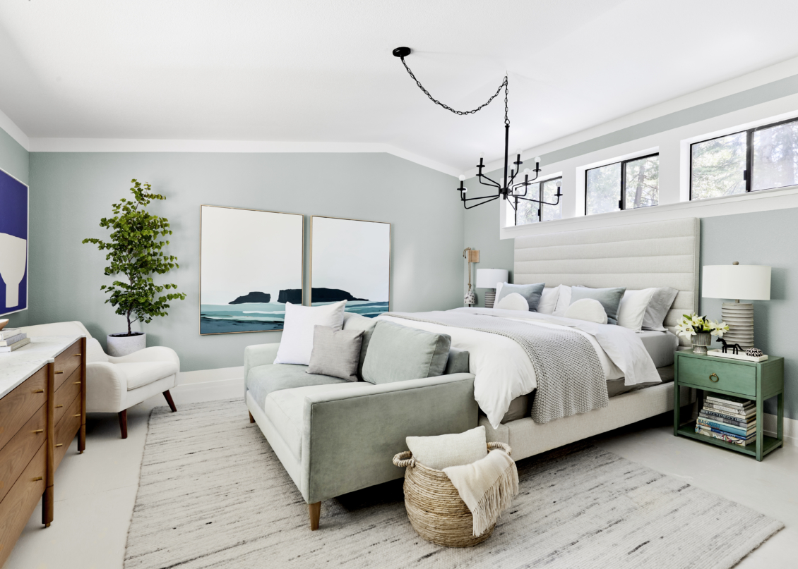
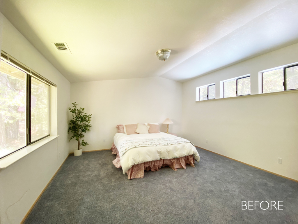
Okay, now that I’ve complained to you about how annoying it is to live alone in the woods while trying to make your 90s box house into a home, let’s chat about the most recent version of my bedroom (which has already changed Sara Tramp took these pics – I’m never really done designing a space!). When I moved into Londo Lodge, I tried to make the furniture I had in my LA apartment work here. Given the vast difference in size between my old apartment and this house, I was shocked at how full the house got when I moved all my furniture here. I loved my old bed from The Inside (see the midway version of my bedroom on a sister post I did for Emily over on her blog).
I’m a big proponent for the idea that all furniture doesn’t necessarily belong in all homes. For example, when my parents moved from their small house in Yosemite to a much larger home in suburban Sonoma County, their old furniture was eaten up by the size of their new house. So I was pretty open to the idea that not all my furniture would survive in my new house. So I was delighted when Jonathan Louis Design Lab, a company I’ve collaborated with before and had so much fun with, reached out about working together to promote their new line of bedroom furniture (which is gorgeous and luxe).

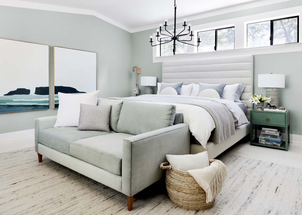
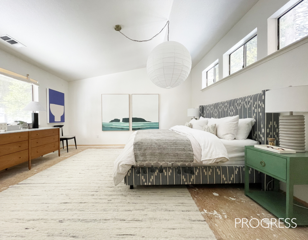
Sources: Bed from Jonathan Louis Design Lab, Sofa from Jonathan Louis Design Lab, Chair from Jonathan Louis Design Lab, Large Throw by Casa Luna, Light Grey Percale Sheet Set by Casa Luna, White Percale Duvet Cover from Tuft & Needle, Decorative Pillows from Jonathan Louis, Basket from World Market, Rug from Momeni, Nightstands from Safavieh, Lamps from Safavieh, Blue Footed Vase from World Market, Matte Black 10-Light Chandelier from Lamps Plus, Art from Minted LeftRight, Blue Art from Minted, Dresser from Egg Collective x Design Within Reach.
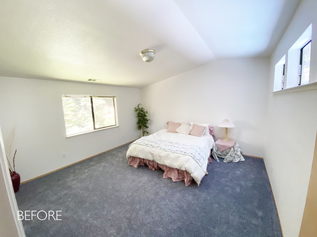
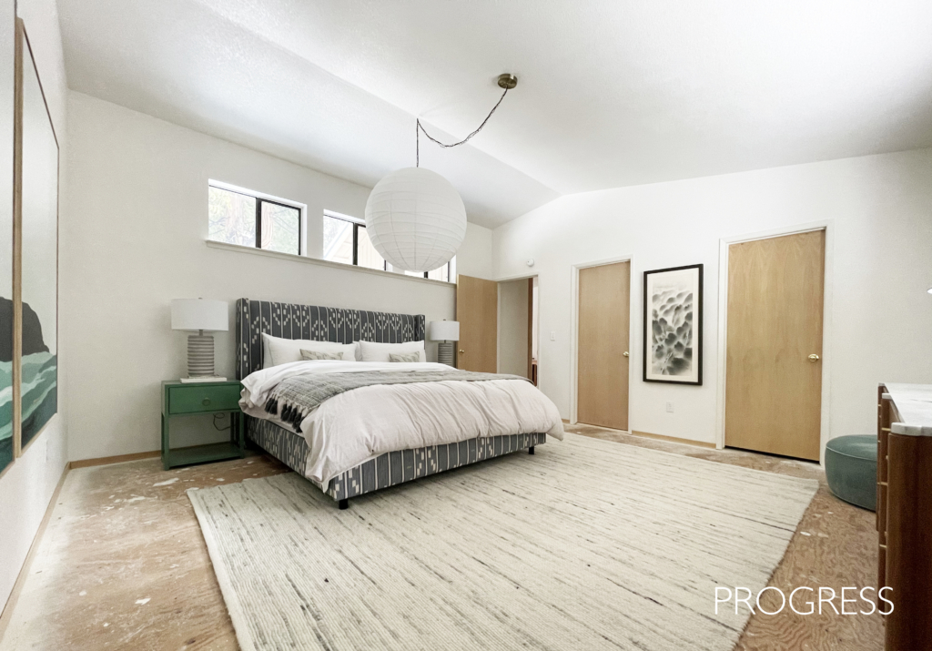
One of the things that made laying out this room challenging was the architecture of the ceiling and the high skylight windows. There was something comforting about where the bed was before, but it didn’t leave much room for a dresser and it made it more difficult to look out the window from the bed. When windows are hung high like the ones on the right side of the room, it just makes sense to put the bed under them. Otherwise it feels weird that you can’t see out them and it detracts from any feeling of purpose in the room’s design. The layout I came up with means every morning I wake up and look out at trees. It also created a natural spot for the dresser so the room has a much stronger sense of composition.
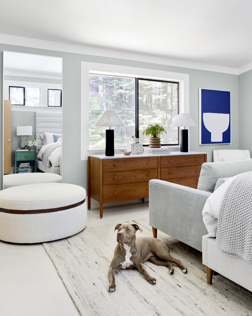
Dresser from Egg Collective x Design Within Reach, Pot by Hilton Carter x Target.
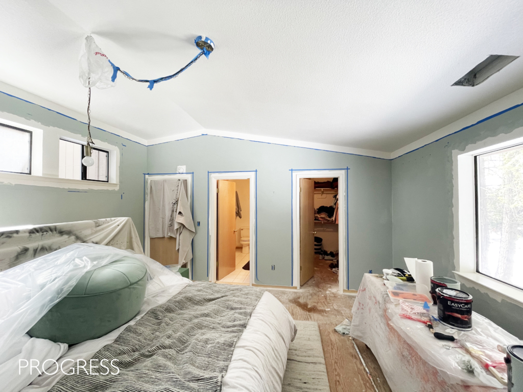
Removing the carpet was a huge pain but it was worth it (you can read more about my feelings on removing carpet and painting the floors over on Emily’s blog). I’ve always loved the idea of having a sofa at the end of my bed, especially for a vacation house like this where creating multiple spots for cozy contemplation is of utmost importance. The room’s wall color is Olive Branch by True Value, a really soothing blue-green-gray-sage that changes color throughout the day. This color is recurring throughout the house and probably my favorite right now because it has the cool, soothing feel of a blue yet has enough yellow in it that it feels warm.
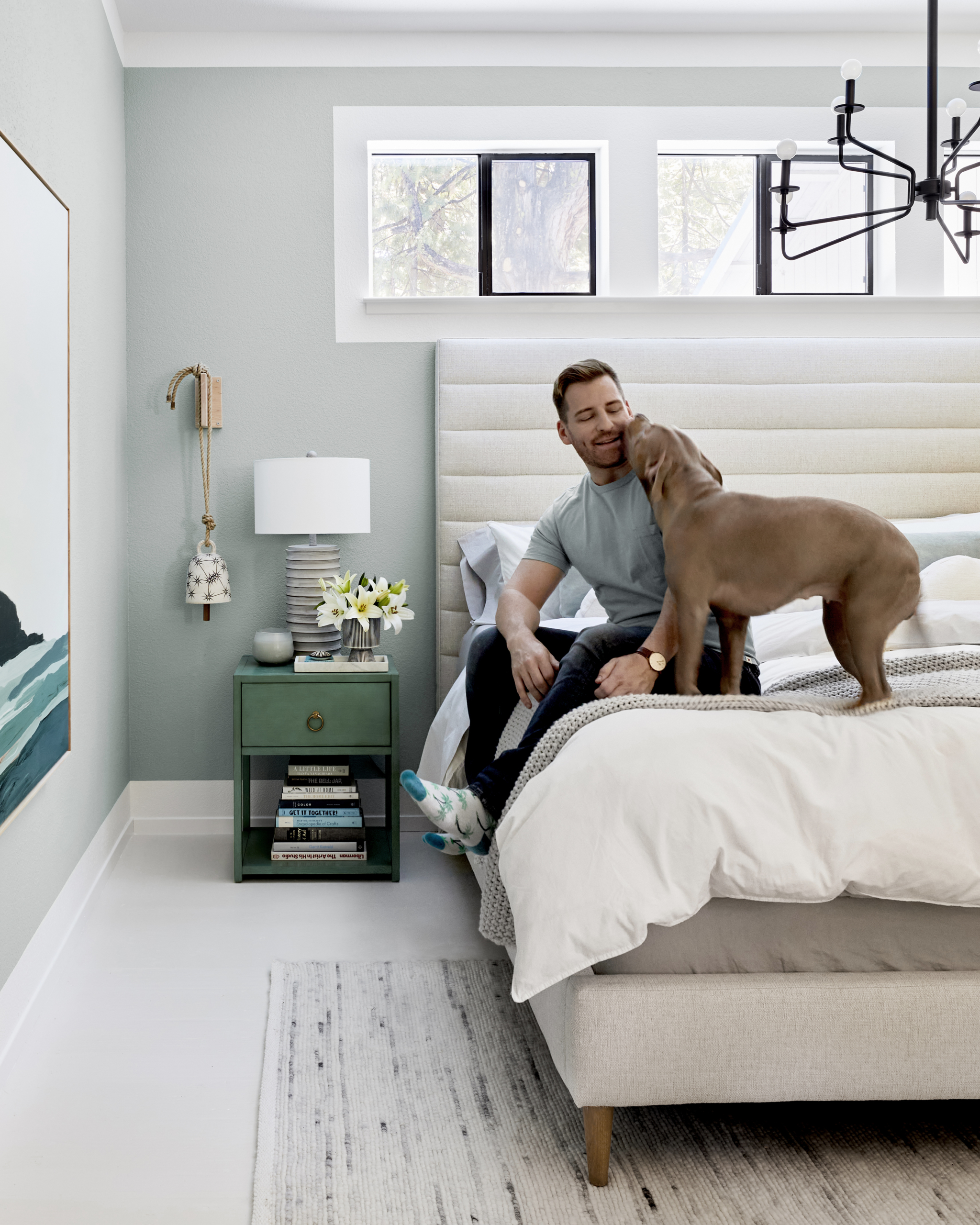
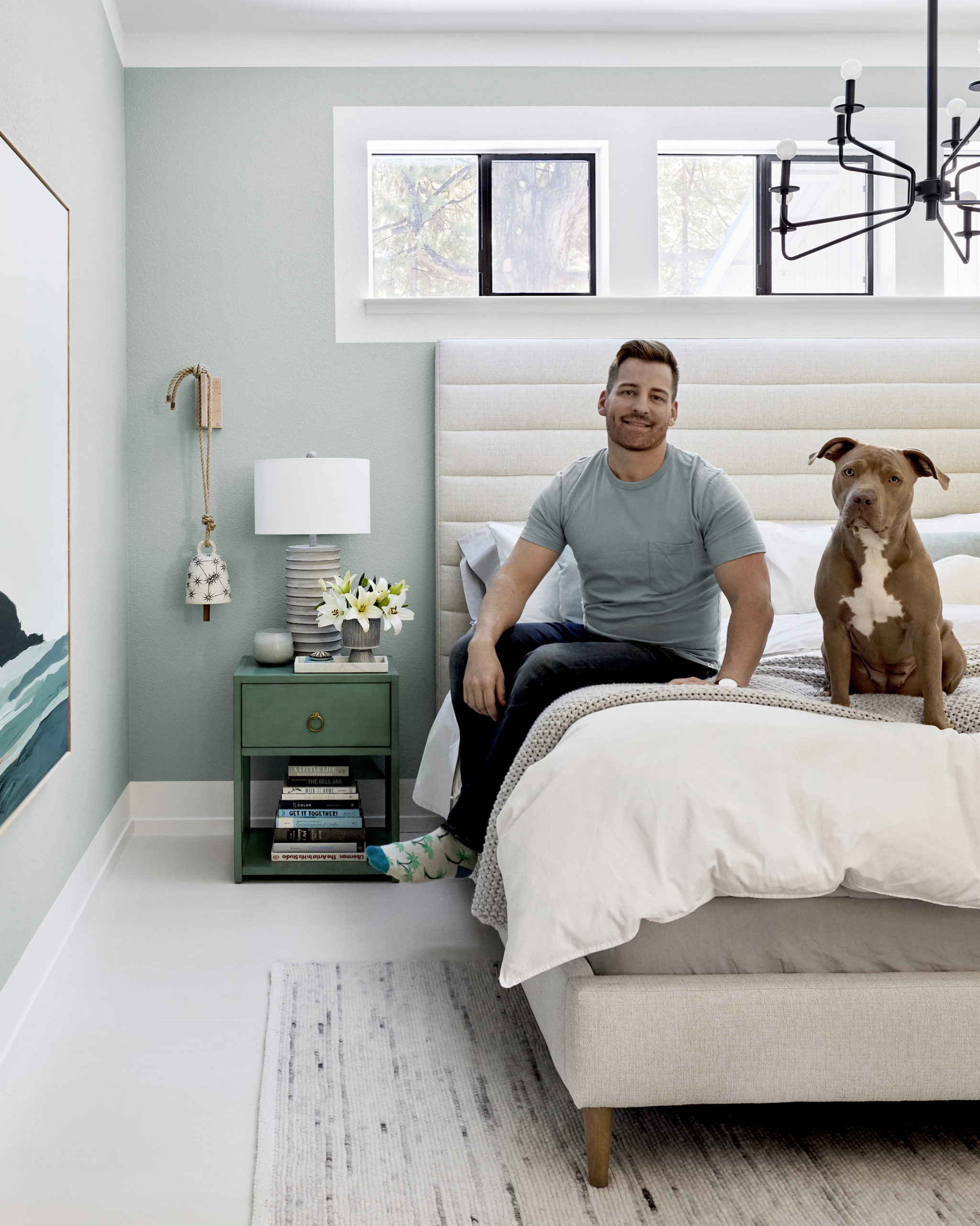
Adding the painted moulding and trim around the room definitely improved the look of the room. Eventually, my plan is to panel everything in the house – the ceilings in warm, natural wood planks and the walls in a pretty lacquered finish with lots of millwork. For the time being, the borders give that sense of structure that trims/moulding provides. One of the downsides of newer homes is a lot of them have so much less detail. I’m not really sure how and why this happened but a hundred years ago we were building charming homes with trim and moulding everywhere and now we’re building boring boxes, drywall corners covered in orange peel texture. Whyyyyyyyy!
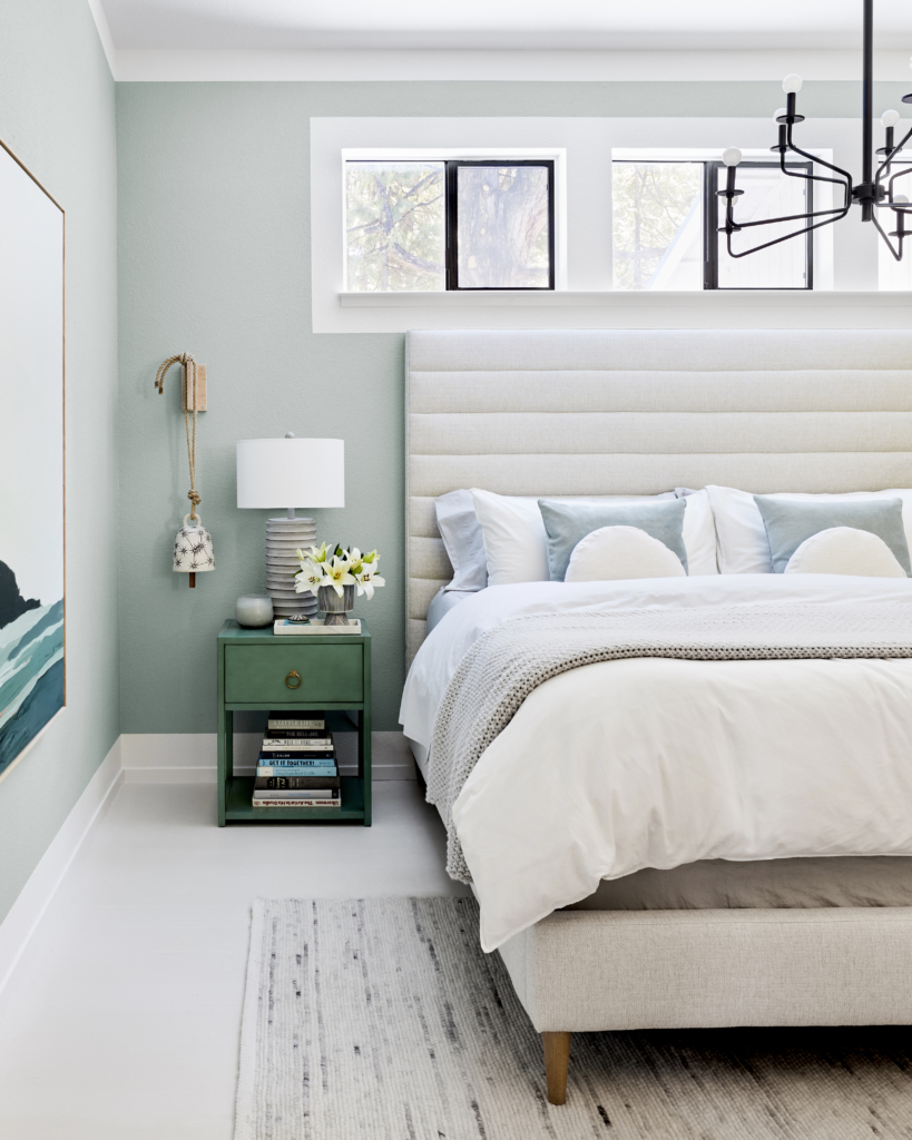
Bell by MQuan Studio, Seaglass Candle from Casa Luna.
One of the great things about this new line of beds from Jonathan Louis Design Lab is that they’re highly customizable. You can choose headboard style, height, finish (ie channel tufting like above or button tufting, etc), leg finish/style, and obviously fabric. I didn’t love the way the blue of my old bed (see on Emily’s blog) contrasted (or didn’t) with the wall so I knew I wanted to go with an oatmeal/ivory color to pop off the wall and up the cozy factor.
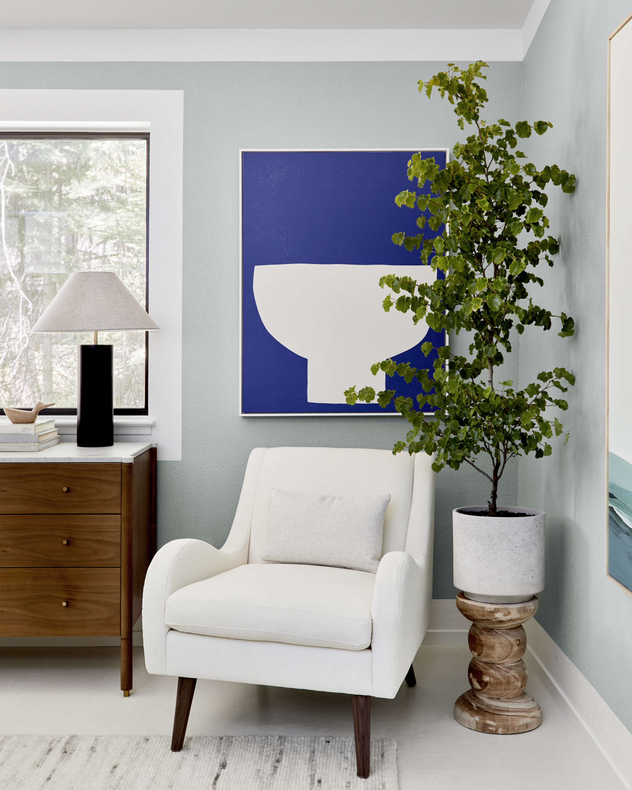
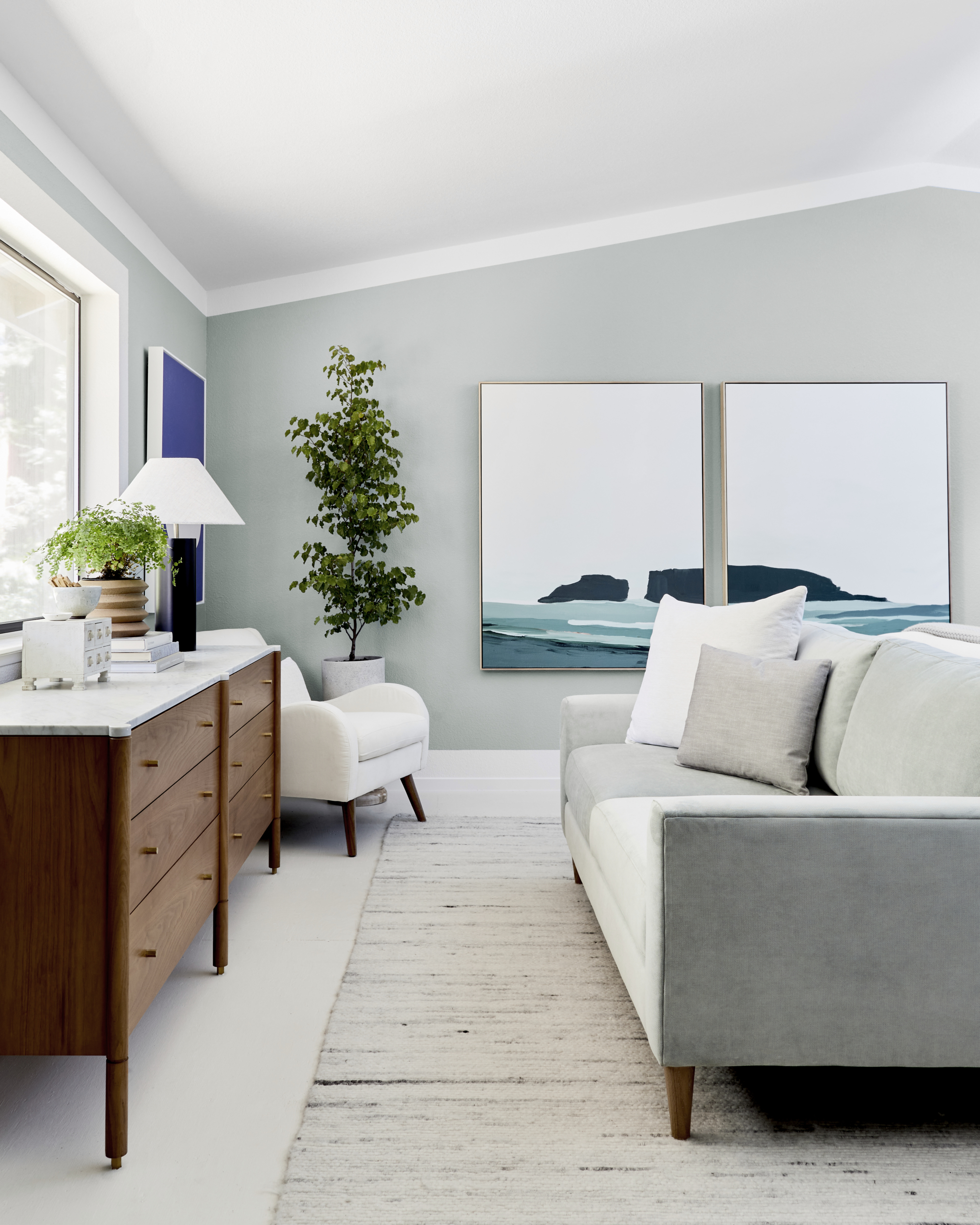
Black Lamps from AllModern, Wall Color “Olive Branch” by True Value, Trim/Ceiling “Powdery Silk” by True Value, Floor “Soft Cashmere” by True Value.
The artwork from Minted adds so much sophistication to the room. I love that they’re selling large-scale art now because scale is normally an issue when it comes to art. One of the reasons I do so many gallery walls for clients is that so many of them have a bunch of tiny art. And when you have a huge wall to fill, small art isn’t going to cut it on its own. Larger pieces make a much bolder statement and I loved the soothing palette of these pieces by Caryn Owen.
Since these photos were shot, I’ve actually updated the room a bit AGAIN. I added some cute lampshades to the chandelier to give it a bit more of a formal vibe. And I lowered the bed and the sofa so the room would open up a bit more. Pro-tip, if you want to increase the feeling of space in a bedroom, lower the bed, it makes a world of difference. I moved the bed and sofa down about five inches and while that doesn’t sound like a lot it makes the room feel much larger.

This looks like a wonderful place to wake up every day!
Love this, the larger scale furniture really cozies it up.
Both rooms beautiful but I particularly loved the first iteration. Some of your best work. I’m sad you will trade out your beautiful doors.
Love seeing your house evolve and also your explanations behind the designs and why some things work better than others. That green is just perfect.
Total drop the mic moment. Wow! Love the exaggerated painting creating architectural details.
It looks beautiful! The paint trick is so smart and impactful. I appreciate that you explained why you switched up the layout. It seems like a no-brainer! Can’t wait to see what else you do!
Love love love what you did with the trim. I thought the first iteration of the room was great, until I saw the second. OMG–you are so talented, and hard working! Such an inspiration!
It looks great! What do you mean by “lower the bed”? Did you remove the legs?
Serene, sophisticated and lovely. I’ve been hanging out for the next post and frequently checked since January – it’s been a long time between drinks! Definitely makes you realise how long a room REALLY takes. You’ve also made me resolve 100 per cent never to remove carpet in a house myself.
I love your writing and find your style so enjoyable and satisfying to read. Look forward to the next we’ll-spaced post.