Things at Londo Lodge have been simultaneously serene and chaotic. I don’t really know how to explain it, but I feel really at peace here while also feeling completely overwhelmed by my daily life. Living here has definitely come with a learning curve and taken some getting used to. I like all the chores involved: tending the fire, cleaning out the ashes, splitting and stacking wood, dealing with the trash and getting rid of construction rubbish, cleaning up the house after every single project I do, figuring out shopping and laundry and bills meanwhile trying to juggle a number of very fun content collaborations I have coming up. In LA, I lived in a little apartment and had a wonderfully talented housekeeper who did literally everything for me (including cleaning my place from top to bottom and ironing everything EVEN MY NAPKINS). I haven’t done my own laundry since 2013. I know, I was super spoiled. But when you work from home, are a total neat freak, and your business is so related to your life, I think it’s a great idea to bring in professional help. Basically, I hired a housekeeper so that home chores were, for the most part, off limits to me. Otherwise, I’d end up spending all day cleaning and doing laundry because if it’s my job I kind of can’t help myself. And when time is money, cleaning all the time is not very profitable (unless you’re charging for it).
Anyway, I didn’t come here to defend having a housekeeper to you. I mainly bring that up to highlight that I had my LA life totally figured out and now I’ve entered into this new world where I’m having to figure everything out again and quite honestly it’s super exciting (but also super time consuming). I really love my little town, Fish Camp is like a postcard of an old timey alpine village. It’s extremely beautiful and peaceful here. No traffic noise or sirens. It’s rained a few times and the raindrops ping the metal roof in the most soothing way possible. The longer I’m here, the more confident I feel in my crazy decision to leave the city behind for a little bit and concentrate on building a beautiful home in the country.
One thing that has been frustrating for me is how hard it’s been to do as much as I want to do. It was my goal this year to get my blog back up and running, to post a few times a week, and to keep sharing tips and ideas to inspire people to think of creative ways to beautify their homes. However, I’ve found that between the chores of country life, frequently hosting guests so I don’t get cabin fever and totally lose it, and actually doing the projects around the house I want to document, it’s been pretty hard to actually produce the content I want to produce. One of the best and worst parts of my personality is that I am never satisfied with my own output, I always want to do more. I guess that’s good because I’ll never be bored. But it can be frustrating because I’m doing so many fun and exciting makeovers around Londo Lodge and I’m just itching to share them with you (in blog format, on Instagram, and in a series of YouTube videos I’m working on). I’m hoping to figure out how to delegate a little better in the new year so I can move things along more quickly, but until then thanks for putting up with my slow pace at sharing what’s going on.
When I moved into this house I planned on just leaving everything the same until I did a massive renovation next year. Clearly, starting a renovation in wintertime right before the holidays, during Covid (in an area where literally no one wears a mask) was not gonna happen. And I was fine with the house in its 90s glory, with its cozy carpet, its dated fixtures, and its strange finishes. But, leave it to me to get itchy to start making it mine just a few weeks after moving in. I was avoiding doing any makeovers or updates until next year, mainly because I was worried about being wasteful. However, I’m realizing that if I’m strategic I can design this house TWICE – first in a more approachable, affordable manner and then in a splashier, more aspirational way that makes it into my dream home – without wasting too much materials or having throwaway furniture. My plan is to choose furnishings that will work in the final space or be donated to someone in my family or community who needs them. I’m not buying anything with the plan to just throw it away when I do my big, fancy renovation next year (?).
I’m also not totally sure when and how I will be able to afford the expansive renovations I want to do to this house, but I know I’ll figure it out. Like many people, my income is totally in flux this year and I’m not totally sure how much I’m gonna make month over month. That level of uncertainty isn’t making me anxious to run out and spend all my savings on renovations, so this first round of accessible makeovers is a way for me to make my mark on my home without feeling like I’m being irresponsible.
The first room I started with was the gym (see planning post here) which is almost done and LITERALLY CHANGING MY LIFE. Sometimes I forget how powerful design is, like having a room that’s pretty can literally make you want to go into it and workout. I literally made a whole show about how design can change your life and I still need reminding of that. The second room I got to work planning was my parents’ guest bedroom.
Eventually, the plan for this room (the only bedroom on the ground level of this house) is to blow out the wall, add an en suite bathroom to it, and install some French doors in it that open up onto a deck that doesn’t exist yet. But, for now I’m taking cues from my mom’s love of Japanese art (she spent her childhood in Japan) and my dad’s love of traditional design to make their room into a cozy place to come enjoy the woods. The reason I started with my parents’ room is that having my family around was one of the main reasons I bought a house this huge.
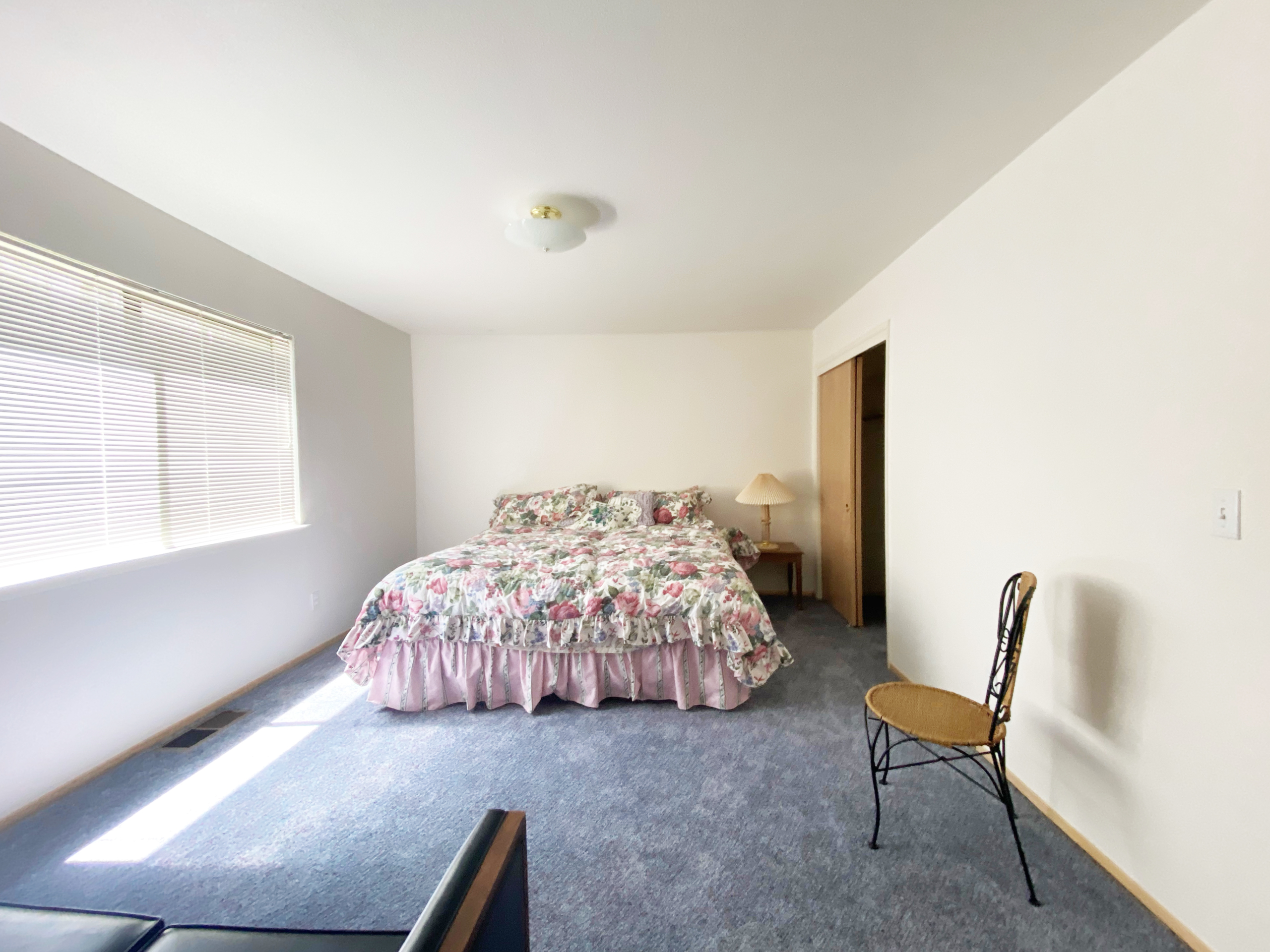
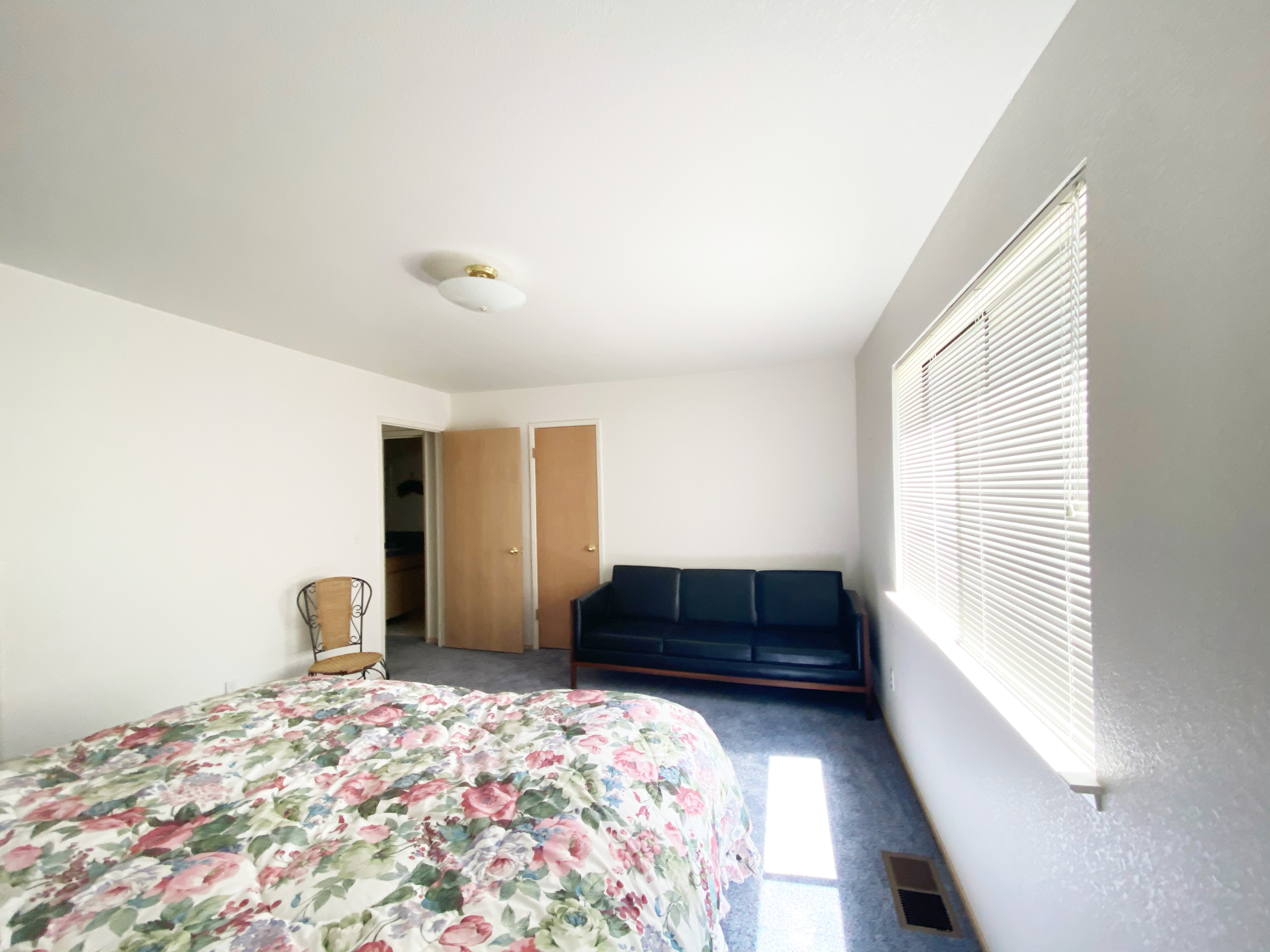
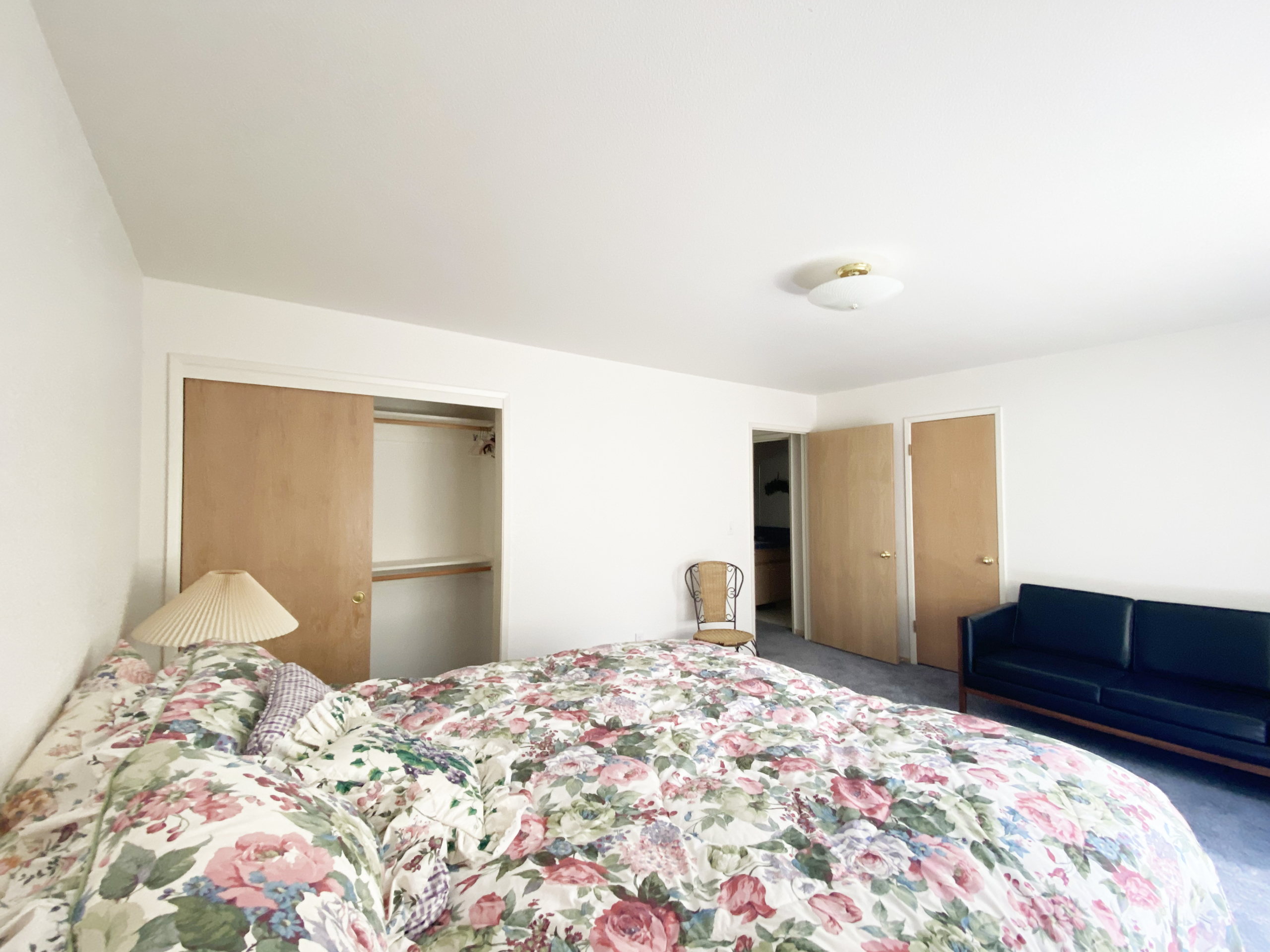
The bedroom is one of my favorite rooms in the house. Unlike my dark, moody bedroom, it gets GREAT natural light. And it looks out onto the giant burn area on the south side of the house. I know that probably sounds kind of apocalyptic, but I actually love that so much sunlight comes in on that side of the house. Another great thing about all the rooms (except the kids room which I turned into the gym) is that they’re all decently sized. They don’t feel small or cramped and they have enough room for king size beds, nightstands, dressers, and all the other accoutrements a grown up bedroom should have. Side Note: my parents slept on a full-size bed the entire time we lived in Yosemite. It was a beautiful aged, brass bed and I’ve been trying to trick them into giving it to me for a while. They now have a queen size bed and think that king size beds are completely ridiculous and monstrously large. I’m putting a king in their room just to mess with them but they’re totally not going to know what to do with themselves swimming in that gigantic bed. Fun fact about me: I slept in a twin bed until I was like 25 – I guess my family likes sleeping in tiny ass beds!
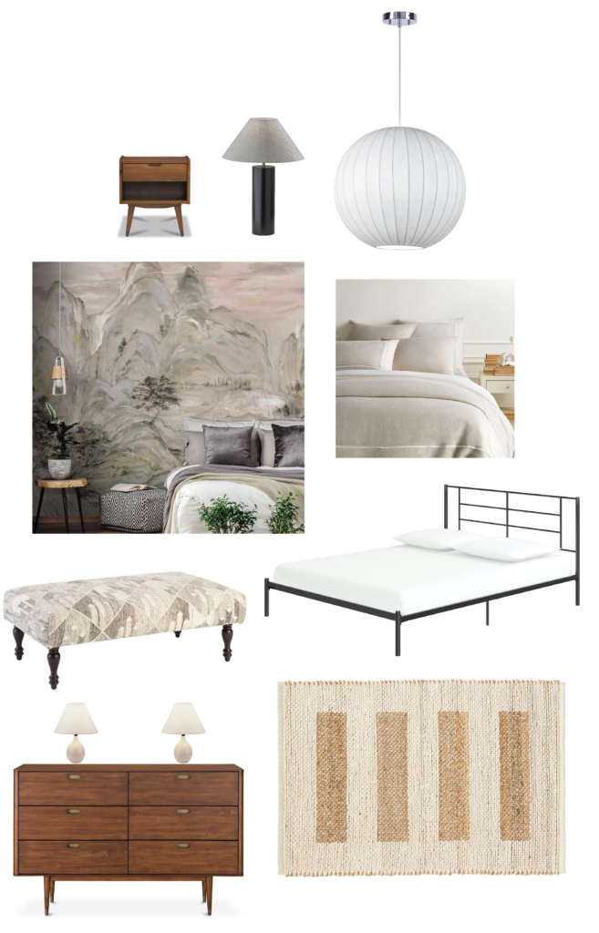
Sources: Nightstands from Scandinavian Designs, Black Wood Table Lamp from AllModern, Globe Pendant Light from AllModern, Wall Mural from York Wallpaper, Linen Duvet Cover from Annie Selke, Black Metal Frame Bed, Bench from Annie Selke, Dresser from Scandinavian Designs, Rug from Annie Selke.
Okay, so WHAT’S THE PLAN???
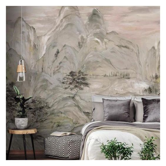
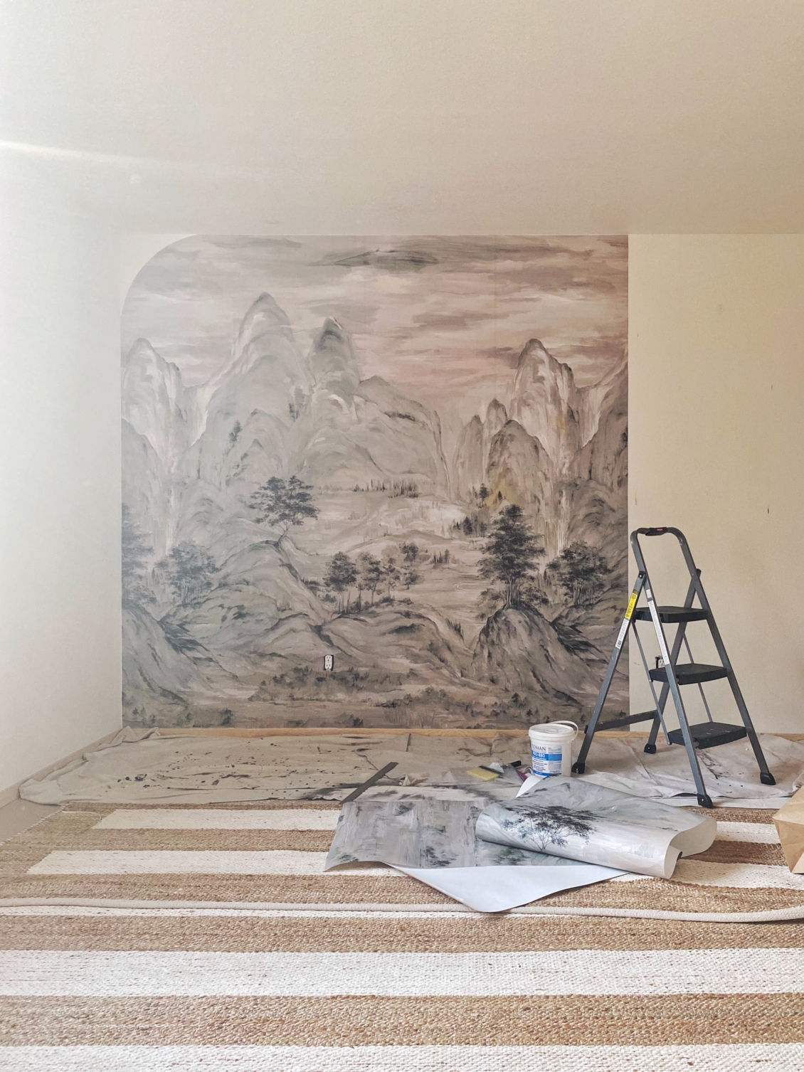
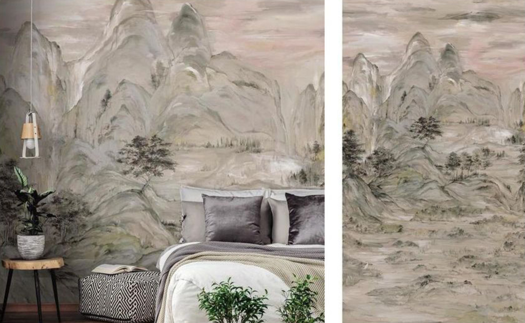
The inspiration for this space came from an upcoming collaboration I am doing with York Wallcoverings. I ended up going with their Misty Mountain Wall Mural which is even more stunning in person than it is online. I selected this mural because it reminded me of a beautiful Japanese painting my mom bought me years ago, which I got framed and will live in that room.
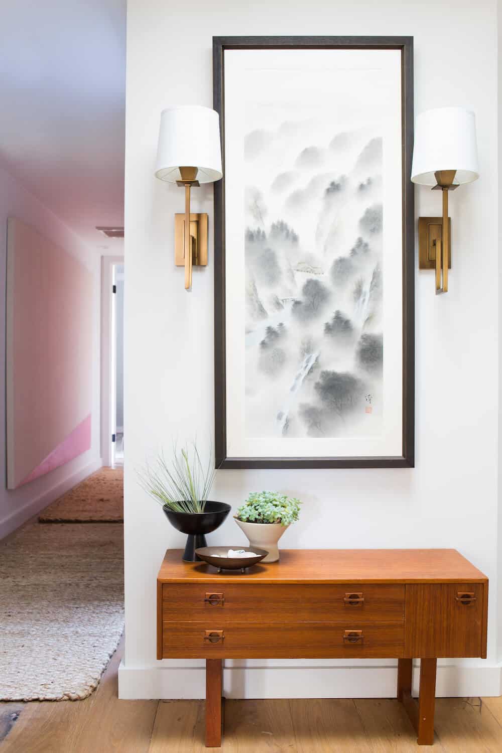
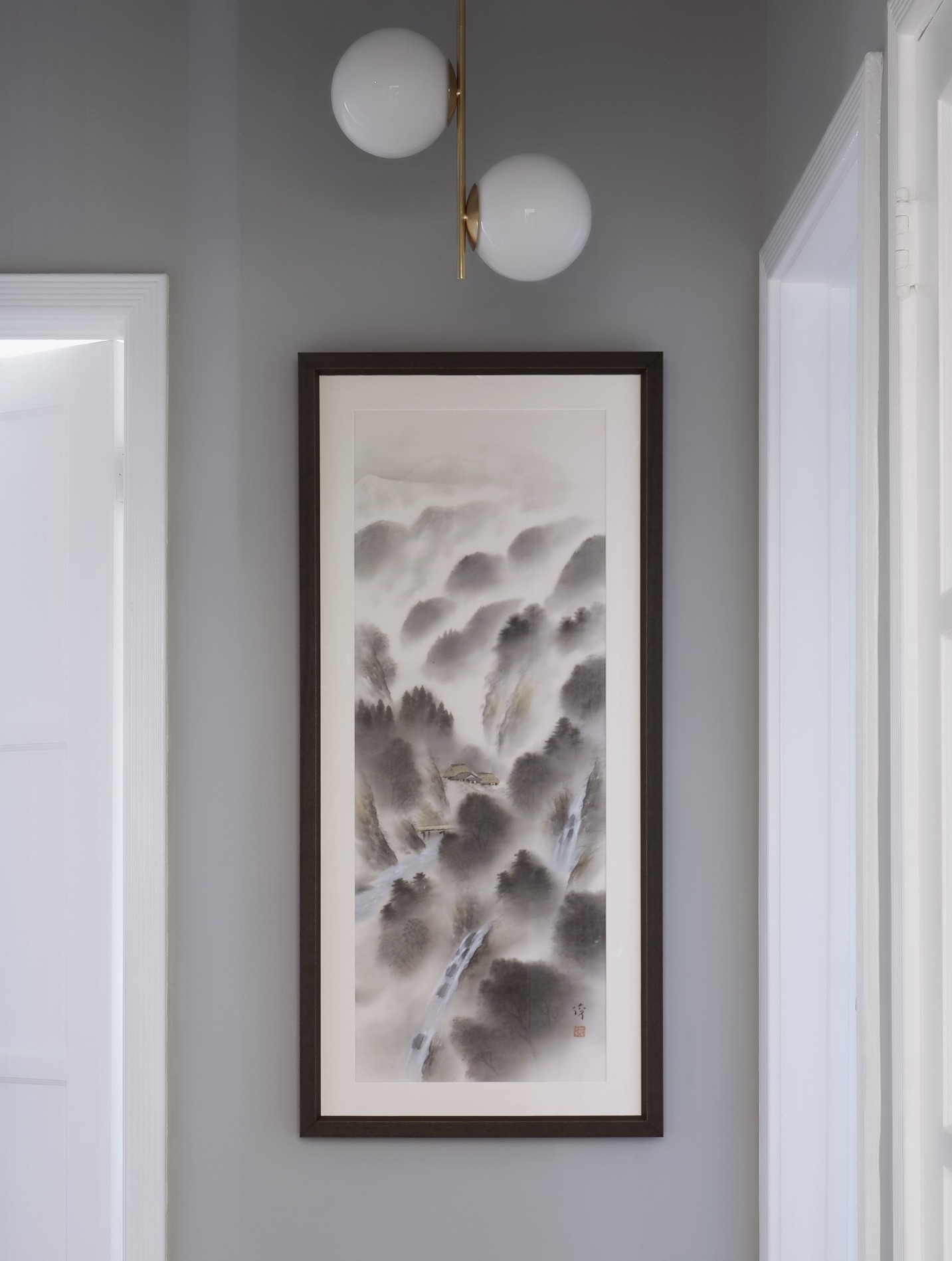
That painting has been in my parents’ guest room since I moved into this place and I love going in there to visit it. It’s just bright and etherial and relaxing, like the room itself. I plan to use that beautiful York Wall Mural as an accent wall behind the bed. The bed is an ACTUAL STEAL (at $150) and is part of the new Queer Eye Furniture Line (full disclosure, I’m doing a full collaboration with them for the holidays and this is part of it). I dare you to find a bed that good looking for $150!
The name of the game in this room is mixing materials, so I’m adding in some mid-century inspired walnut nightstands and a classic dresser from Scandinavian designs. orMOMdo is helping me do some really cute DIY window treatments in here using some leftover artist canvas I had.
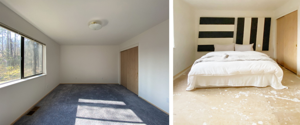
I’ve been slowly going through the house room by room and tearing out the carpet. It pains me a little bit because the carpet is SO cozy. However it feels good to get rid of it because it’s impossible to get a beautiful photo of any space it’s in. I’ve had a few people suggest I try to incorporate it into my design plan but honestly, I don’t know how I’d make that work. I’m a good designer but not *THAT* good. The other added benefit of taking it out slowly, room by room, is that I can get rid of it every week when I go to get my covid testing done in Mariposa. Construction dumpsters are strangely expensive here (about $1000 for two weeks) so it’s saving my money to just get rid of this over time. The downside: removing carpet is hard on your hands and mine have transformed into bloody stumps at this point. Ripping out the carpet isn’t the hard part. It’s the repetitive motions required to remove the MILLIONS of staples that attach the foam padding underneath combined with the awful, pokey nail strips that adhere the carpet to the corners of the room. I love working with my hands but they’ve never been so cut up and destroyed before. All worth it to make this space beautiful!
After I removed the carpet, I painted the edges of the flooring with some leftover beige paint I found in the garage (the home’s exterior paint color). I got a huge and gorgeous rug from Annie Selke that covers almost the entire floor, so I only needed to paint about 12″ around the perimeter of the room. I have been experimenting with painting directly onto the sub-floor in different parts of the room and really liking it. The floors themselves have a lot of texture and character and painting them gives a rustic, arty feel that I really like. Eventually I want wide-panel, farm-style wood flooring throughout the house but I love this as a fun, playful way to address the floors and I honestly would consider keeping it if the style I was going for with the final design wasn’t so formal.
I want this room to feel really cozy and welcoming but I also want it to feel special (LIKE MY PARENTS) so combining minimalist, streamlined furniture with a dramatic wall mural felt like the right way to go. I’ve been working my butt off to try and get this and a number of other projects around the house done and this one is nearing completion (I’m waiting on a few deliveries). One of the biggest lessons I learned in doing this room? Wallpapering isn’t as hard as I thought it would be! I sourced an unpasted wallpaper from York, meaning I had to brush paste onto the wall to do apply it. However I was surprised at how easy it was to do as someone who’s never done it before. I think I chose a particularly forgiving pattern, with a ton of texture to mask the orange peel texture of my walls, a matte finish to hide any bumps, and a large enough pattern that it was easy to match up. Now I kinda want to wallpaper every room in the whole house!
I’ll be back with updates on this room VERY SOON. Next up, the reveal of the GYM, which has been making my life SO MUCH BETTER the last few weeks. Okay bye!

3 thoughts on “Londo Lodge: Planning orMOMdo + orlanDAD’s Guest Bedroom”
Comments are closed.