Dear Art Lovers,
Over the years, something I’ve found inescapable in my design work is the practice of moving stuff around (aka playing) until I find just the perfect spot for every piece of furniture. You can make all the plans and layouts and plans you want, but sometimes when you get into a space the furniture wants to be arranged in a completely different way than you might have expected. In my experience, this is what separates the really good designers who create really authentic looking, attractive spaces from the designers who create boring, cookie-cutter spaces that lack character.
While I spend a lot of time lugging sofas around whilst sweating my face off, I also tend to move art around quite a bit, too. So when Saatchi Art approached me about collaborating with them on their #NoBlankWalls campaign, I thought this could be a fun learning moment to chat about the importance of trying out art in different spaces before committing to a permanent location (sidenote: in my house, nothing is permanent. I move art around all the time).
After browsing the Saatchi site (which has over 500,000 works on it), I quickly became obsessed with the work of Alyson Khan. Here she is, being adorable in her studio with her dog:
And here are a few of her incredible paintings:
If you would like even more pleasurable eyeball explosions, you can see more of her work here.
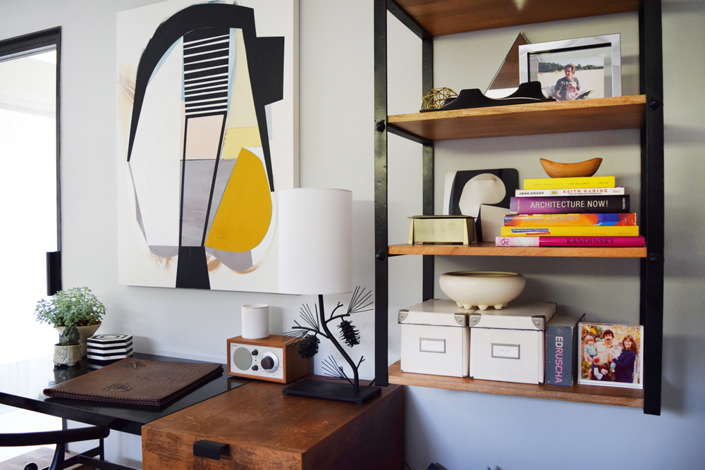
I ended up choosing a lovely piece with a gorgeous pop of ochre in it. The first room I tried it in was the guest room, which has an amazing Japanese screen I’m obsessed with and other gold accents. The room has a bit of a rustic feel, with a vintage desk and an antique wooden crate, so I liked that the painting brought in a modern, graphic vibe.
Alyson’s paintings are painstakingly perfect. A few process shots she sent me show the lovely details of the painting and how she tapes off her lines to get them crisp and perfect.

I love looking at close-ups of paintings. Brush strokes are so satisfying and luscious to ogle.


A lot of people have been asking me about this desk lately. It actually belonged to Edouard’s grandfather and is by a French designer named Pierre Paulin. It’s a great piece and a lovely place to sit and get some work done while thinking about how much I love France.
The next place I tried the painting was upstairs in our TV loft. We have a cute little loveseat up there that we literally never sit on (the larger sofa is way more cozy). The painting looked a little out of place so I added a gold accent pillow and an ochre throw to make it feel a bit more cohesive.


The ivory accent pillow is from Loloi and it makes my blood boil with desire every time I look at it.

Finally, I tried the piece in the living room, right next to the breakfast bar.

One thing that I love about it in here is that it reflects the color in the beautiful Cleon Peterson print we have hanging across the room.

I also love how deliciously the painting goes with my crazy gorgeous Waterstone faucet. That faucet ended up being WAY more expensive than we wanted it to be, and we kind of debated about it for months because it seemed ridiculous, but it was a splurge that makes me happy on a daily basis so it was worth it.
See? Doesn’t it tickle you to see that faucet being like “HAY GURL” to the painting? And the painting’s all “THAT’S RIGHT.” I’m not sure which location I’m going to keep the painting in, so please leave your vote for your favorite in the comments.
Love,
Orlando
BUT WAIT THERE’S MORE!!!
WIN AMAZING ART: Saatchi Art is doing a fun sweepstakes in conjunction with their #NoBlankWalls campaign. They are giving away a $1000 gift card (which you can use toward any of the 500,000 pieces they have online. DID I MENTION THEY HAVE OVER 500,000 AMAZING WORKS OF ART? Yes I did. Repeatedly. I’m sorry). All you have to do to enter is snap a pic of a blank wall in your house that needs some art, hashtag it #NoBlankWalls and tag @saatchiart. It’s as easy as that. You can find more details by checking out Saatchi Art’s Instagram Account.
This is a sponsored post created in collaboration with Saatchi Art. Opinions and ideas expressed are genuine and my own.


It’s perfection in your living room. You can’t take it away from the faucet now that they’re so tight!
Near the kitchen (Hay Gurl!) is perfect.
Duh, you can’t break up that faucet, painting romance.
in the guest room for sure!
It looks fantastic it all three places!! My fave, though, is near the breakfast bar. I almost voted for the guest room, though– but there’s alot of angles/lines happening there (for me) so the breakfast bar won out…. I love how the that cool ochre color brings out your faucet, but I also really like how the top (black) arc in the painting ‘speaks’ to the arc that is the back to your stools…. very cool!
By the breakfast bar, no question!
Such a beautiful painting! Would like to buy them all, plz.
Breakfast bar for tap romance, above the Paulin desk for up-close ogling.
the breakfast bar location is great! fun post – thanks