Photos by Nicole Lamotte, Courtesy One Kings Lane
Dear Reader,
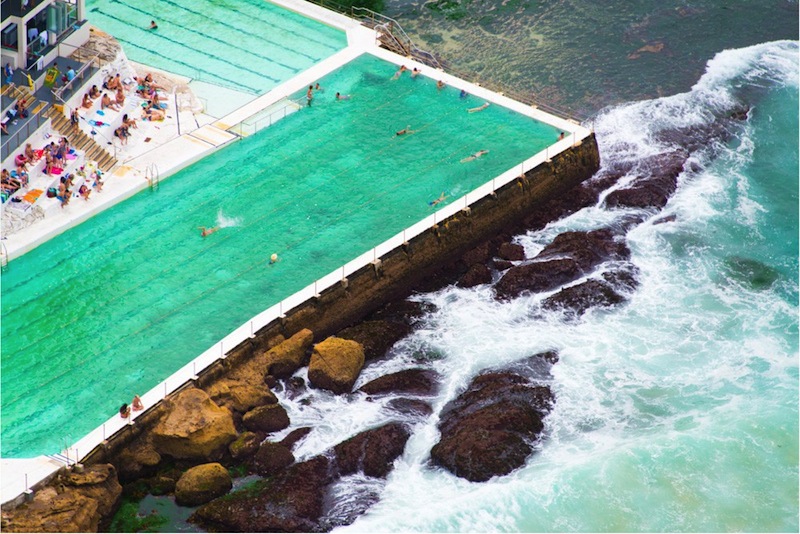
By now, you’ve probably heard of Gray Malin (pictured above with his hubz Jeff and my scaryface), the brilliant photographer who took these gorgeous photographs:
As you can see, these photos are right up my alley. We both love Miami colors, tropical locations, and the coastal aesthetic. You can check out the rest of his beautiful portfolio online.
Homepolish hooked me up with the opportunity to design Gray’s home, starting with the living room and outdoor spaces. In collaboration with One Kings Lane (who sponsored the project and donated their lovely home furnishings), we created a preppy space with the color and sophistication Gray and his husband Jeff wanted (Sidenote: they are the cutest couple in the world. I ogled their wedding book and literally wanted to die because it was so sweet).
We selected this elegant sofa because Gray wanted something that was both comfortable and sophisticated. Quick tip: if you’re looking for a comfy sofa make sure you seek one out with lots of down in the cushions. This will mean you will have to reshape the cushions every day but will make it way softer and more inviting. The sofa we chose is called the Dunsmuir (all products in this post are sourced from One Kings Lane).
The crazy gorgeous Geometric Étagères were a game-changer and immediately made the space look more beautiful, the ceilings higher. I styled them using Gray’s collection of family photos, art, and objects, and trays and accessories from One Kings Lane.
I love that dog portrait, kinda wanted to steal it.
One of the challenges of this project was keeping it colorful while not making it look like a rainbow exploded all over the house. Gray loves color. I love color. But his main goal was a sophisticated, grown up space so I had to keep the color intentional and well-curated. Luckily, these beautiful nightstands served as the perfect console tables flanking the bay window AND they echoed the gorgeous colors in Gray’s Swimmer Photo Series, which we placed above (Sidenote: decorating for an artist is the BEST because you don’t have to worry about finding art, which is normally totally annoying and hard and no one wants to spend any money on it).
I’d by lying if I said these chairs weren’t my favorite part of this project. I am a huge Milo Baughman fan, so these Baughman-inspired pieces speak directly to my tender, needy heart. I love how modern and out-of-control chic these are (I totally want them for my own home).
See??? I told you those chairs were the best thing in the world! Also, those roman shades. I had them custom made for Gray by The Shade Shoppe and they are so lux that I just want to tear them down and wear them as a tuxedo to a royal wedding.
You can check out a detailed behind-the-scenes story about the makeover on Gray’s Blog. Also, check out these links:
To get design services: Homepolish
To source the items seen at Gray’s House: One Kings Lane Gray Malin Homepolish Sale
To see more of Gray’s beautiful work: Gray Malin
Enjoy!
Love,
Orlando


No wonder you filled your bed with turquoises and corals when you were going to Maimi–you were all primed for tropical colors.
I love your work, Orlando!
I didn’t think it was possible for you to become adorabler. Well done. It’s all lovely and fun to read and makes me hate everything in my house.
Ooo I love the tropical colors…And those shelves are really fantastic. Also I’m pretty sure I have only seen very pretty people in your blog. Way to curate. ; )
What a gorgeous room! I want to live there…those chairs and the use of color! I am a huge fan of Gray’s work and am typing this while sitting under his St. Tropez work that is adorning my wall
Orlando, congratulations on your beautiful & inspired design! I enjoyed the behind-the-scenes post on Gray’s blog immensely. I keep revisiting both blogs because I just can’t seem to get enough -truly lovely/dynamic/inviting/energizing/comforting and totally & completely gorgeous..! (can you tell I really, really like it..?)
Love those shots of Bondi in Sydney, i have the same pool as the header picture on my blog http://macarthursmutterings.wordpress.com/ only taken from a different angle
Beautifully designed space! Can you let us know what color the walls are?
There is a whole lot of good looking in the first image. I had a hard time scrolling down.