Dear Reader,
As you may have noticed, I’ve done a little bit of restyling to Hommemaker.com. The changes include:
▲ Wider pictures (formerly 500 pixels wide, now 700 wide).
▲ Simpler, cleaner navigation featuring four main categories: Art, Decor, Life, Style.
▲ No ads. Although this is going to change. I’m working on incorporating ads for products and services I actually like and use. When they come back they’ll be hand-selected and more thoughtfully worked in to the site’s layout.
All of these changes were made possible by my awesome web designer Forster Rudolph.
The whole redesign is a sort of mini-rebranding for me. Because I like to cover a lot of different topics, from interior design to gay body dysmorphia, I decided to simplify the categories so that people can just look at what they care about. Thus, if you stumble upon the blog on a day when I write a “Life” post, which will inevitably be a personal rant or a post the oversimplifies Gay people, you can just scroll on over to one of the other categories and see what’s going on over there.
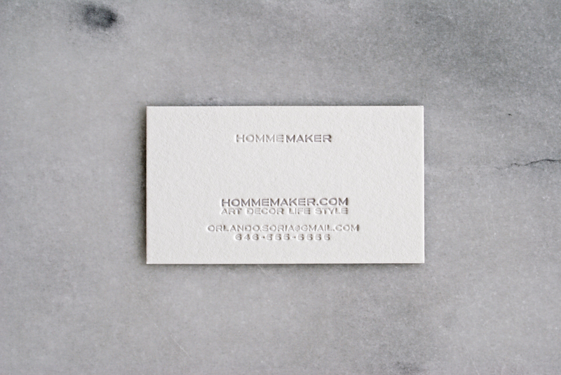
My friend Misako, who runs the New York letterpress design studio To You From Me worked with me to develop those categories in order to help me define exactly what my brand was about. Additionally, she designed an utterly gorgeous business card for me. It’s letterpressed on both sides and printed on paper so thick and luxurious you just want to bite it. I wanted to keep the design of the card as simple and minimal as the blog, so one side features just my name and the other side features all the basic contact info. I love how it turned out. Here it is!
Yes that is a fake phone number. But that is my real area code. HAY 646! That’s my New York number and I’m never giving it up because it makes me feel 21 and reminds me of how excited I was to get a new phone number and a Motorola RAZR at the same time (remember how exciting those were when they first came out?). The font on my card, blog, and logo is Blair. I have loved this typeface forever. The “Hommemaker” logo features a hand-drawn version of that font, with pointier “M’s” and “A’s.” Oh my god are you bored yet? I’m sitting here, like, nerding out about fonts (Sidenote: I have a graduate degree in graphic design, I love this stuff!).
A special thanks to Forster Rudolph for helping me make this blog look how I wanted it to look. And to Misako at To You From Me for helping me with my rebranding.
Love,
Orlando


But–but–we’re interested in everything that you have to say! Oh, well! Four blogs for the price of one!
And the fresh design should be a model for all websites–
This reminds me of the scene from the movie American Psycho. You do like your business cards.
Hi. It looks great.
However, I think the font size for the body font should be bumped up a point or two. At the current size, the amount of text per line in each paragraph is too long.
Don’t get me wrong…it is very nice, but at a larger size (with less words per line) it will be much easier to read.
Here is more information so you know this isn’t just some nuts opinion 🙂
http://baymard.com/blog/line-length-readability
Deliciously Blair. Congratulations on the re-branding… though all forms of Orlando are delightful.
So lovely! That’s crazy similar to the business cards I’m having redone for my own business rebrand, although my actual rebranding was back in February, haha. (Cards this swanky are expensive for a tiny business that isn’t design focused!) I’m also getting two-sided letterpress, and I’m hoping to budget for a studio that can paint the edges the same deep red as my logo. It’s so sexy with that thicker paper! My actual design is a little different and less minimalist than yours, but I’m obsessed with my own beloved font family (Franklin Gothic). Don’t ever apologize for talking typeface to us, haha. We love hearing about ALL your design passions!
ok, this is going to sound dumb….but I love the way the “K” looks in Hommemaker!! Also the pointy “M”!
See, you aren’t the only person who looks at this stuff! They look good!
I love your blog, Instagram photos, design work, insightfulness & sense of humor!
A couple of comments and questions: Before you restyled your blog, you had a portfolio section with photos of your interior design work. Will you have your portfolio as part of your blog again–or is it still here somewhere and I’m missing it? Also, unless I’m doing something wrong, if I’m on another section of your blog, such as a post under “art” or “décor” or a post in your archives, I’m unable to get back to your main homepage by clicking on the “Hommemaker” heading; rather, I have to use my page back arrows–just an FYI.
Thanks so much! Your blog and photos are a daily must.
Found the link to your portfolio on your “About” page–thanks!
Love the look of their new branding.
Looks great! Whenever I get new cards done I’m obsessed with them. Like look at them all day….I feel ya.