Dear Diary,
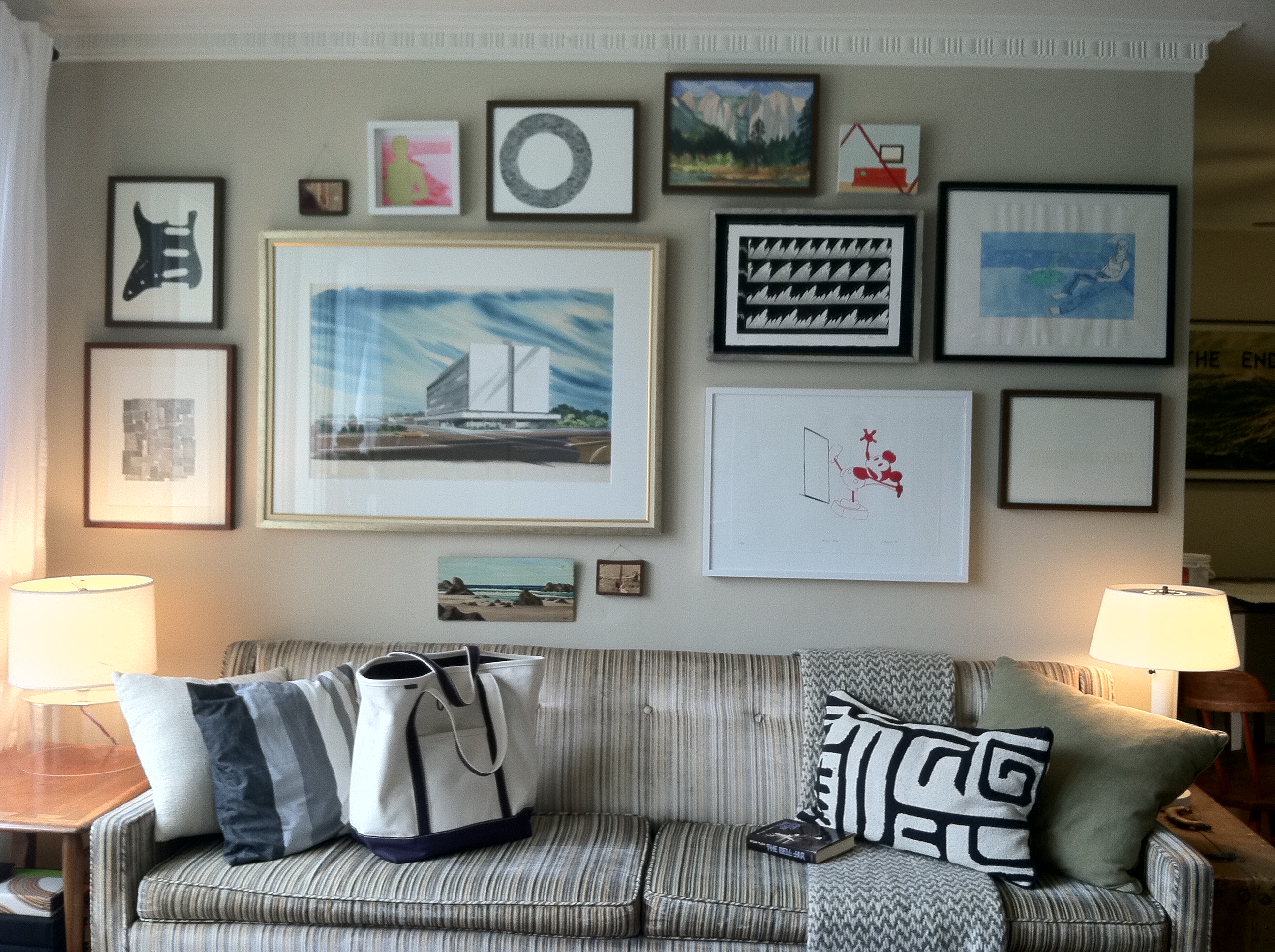
I have a gallery wall in my living room. The other day I looked at it and got bored so I decided to play around with it. I’m actually not sure I like the changes I made but I’m going to share them with you anyway, Diary, because you’re always there for me and you never let me down. Anyhoo, here are some before pictures:
Sidenote: How rad is my Lands’ End tote? I just got it and I’m kind of obsessed.
To stir things up, I nixed the mid century architectural drawing and added an ugly painting I made last week. I actually like the painting and I think it ads a bit more of a modern look since it’s not in a frame and is a little more graphic on the wall. Here are some after photos.
Here are a few close ups of some of my favorite pieces. I found this one at a flea market.
I don’t really know what Mickey is up to here, but I love him so I love this piece.
Across the room, I replaced another one of my paintings with the architectural drawing from the gallery wall.
So, in conclusion I’m not 100% sure my apartment looks any better. It’s just different and exciting. And sometimes when you start to feel your house getting stale, you should shake things up a bit, right?
Love,
Orlando


Orlando, I think your apartment is smashing.
Super cool. And moving that architectural drawing has kind of made your man corner even manlier.
love the blues together, & how the wall is fille top to bottom, the Mickey picture adds a dash of spice and laffs
Where’d you get that landscape scene that looks vaguely like Yosemite?
Hah! You nerd. I think you painted that! I stole it from your house. Love.